Here's how it was before for comparison. See how the icons were brighter? This goes for other text too, which seems to have been made darker

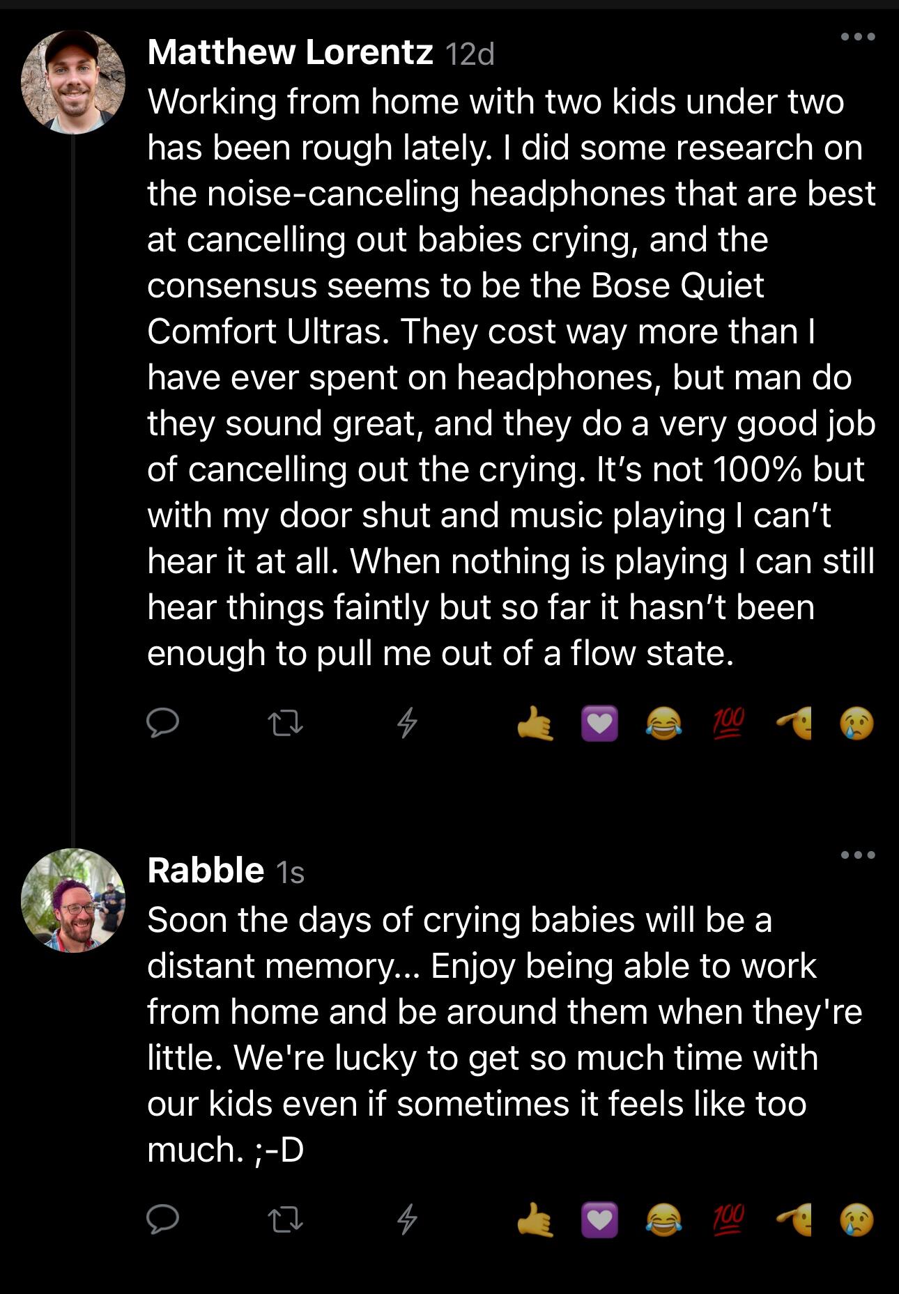
Here's how it was before for comparison. See how the icons were brighter? This goes for other text too, which seems to have been made darker
