

1. Clean and simple. 2 can be nice but looks not yet finished and too much
Discussion

I feeeel that!! I had also done two more variations of that one, but didn’t like them as much idk 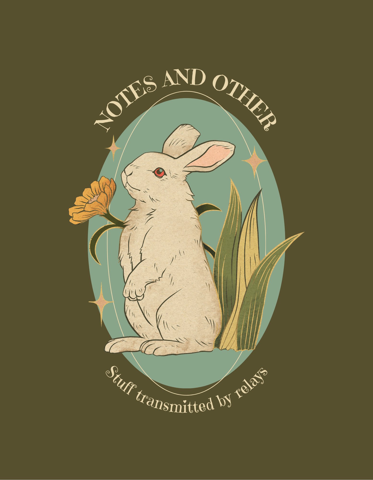
Yeah I like when it clear. But maybe its the Font and oval background what I don’t like.

Oh.. 1 is good.
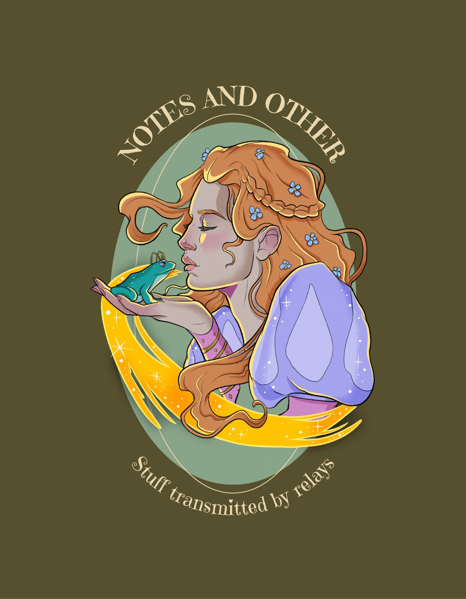
Don't zap me.

Her shoulder and arms leaves me thinking that there could be a big playful toadstool design.