Global Feed Post Login
Replying to Avatar hodlbod

I am soliciting design help:

A friend told me he shared Coracle the other day and had to cringe at my logo. I personally like it, but the line weight is a bit of a problem — it doesn't scale well either up or down, and isn't either clearly the letter C or an image of anything.

I spent some time on midjourney trying to get it to spit out an improvement. It came up with some interesting ideas, but I'm not sure I really like any of them.

I want to avoid some sterile crap like is currently the trend in logo design. I like the wave/coracle idea I currently have and mostly want a better execution, but if there's a lot of feedback that some other idea is an improvement, I'm open to changing.

?width=673&height=673

?width=673&height=673

?width=673&height=673

?width=673&height=673

Avatar
Niel Liesmons 2y ago

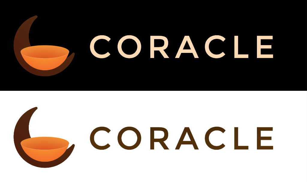
Might not be your style, but I tried a combination of the bowl-shaped-boat, the moon and an aspect of an oracle.

Reply to this note

Please Login to reply.

Discussion

Avatar
Niel Liesmons 2y ago

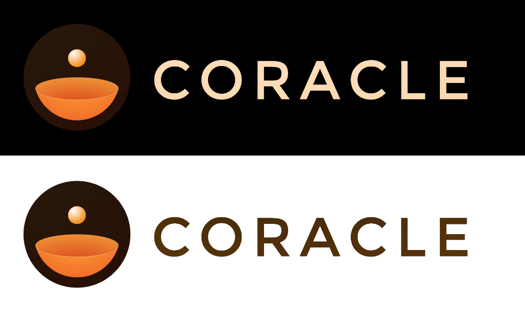
Not possible to upload multiple pictures in one post on coracle?

Avatar
hodlbod 2y ago

These are very good! Yeah, adding multiple files is something I need to add.

Thread collapsed
Avatar
hodlbod 2y ago

What font is this?

Avatar
Niel Liesmons 2y ago

Montserrat.

One of the only great looking ones where the "C" is as round as the logo.

Avatar
hodlbod 2y ago

Ah nice, thought it looked familiar

Thread collapsed
Thread collapsed
Thread collapsed
Thread collapsed