I am soliciting design help:

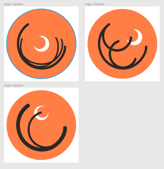
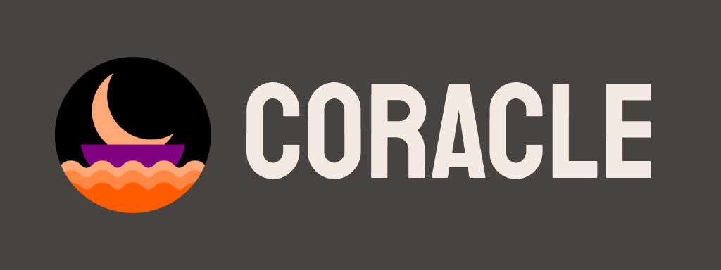
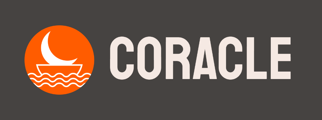
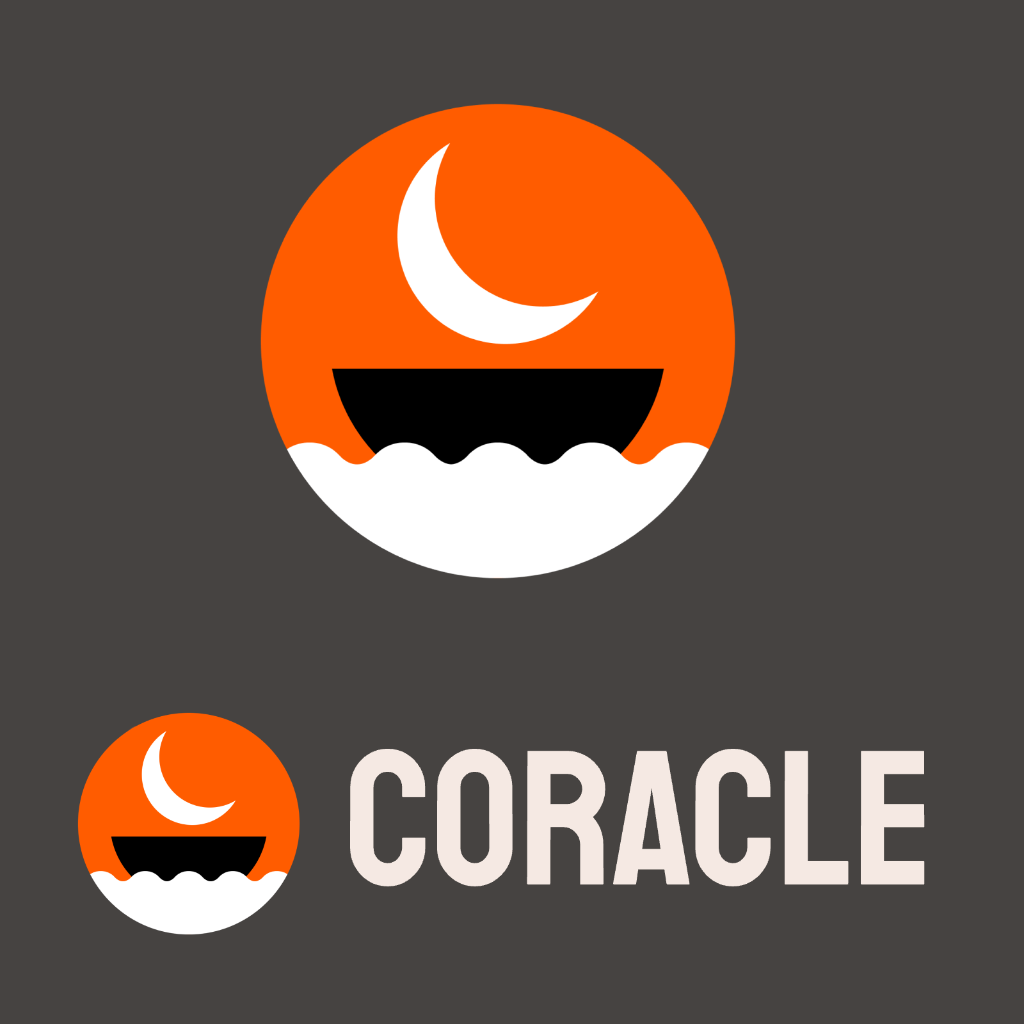
A friend told me he shared Coracle the other day and had to cringe at my logo. I personally like it, but the line weight is a bit of a problem — it doesn't scale well either up or down, and isn't either clearly the letter C or an image of anything.

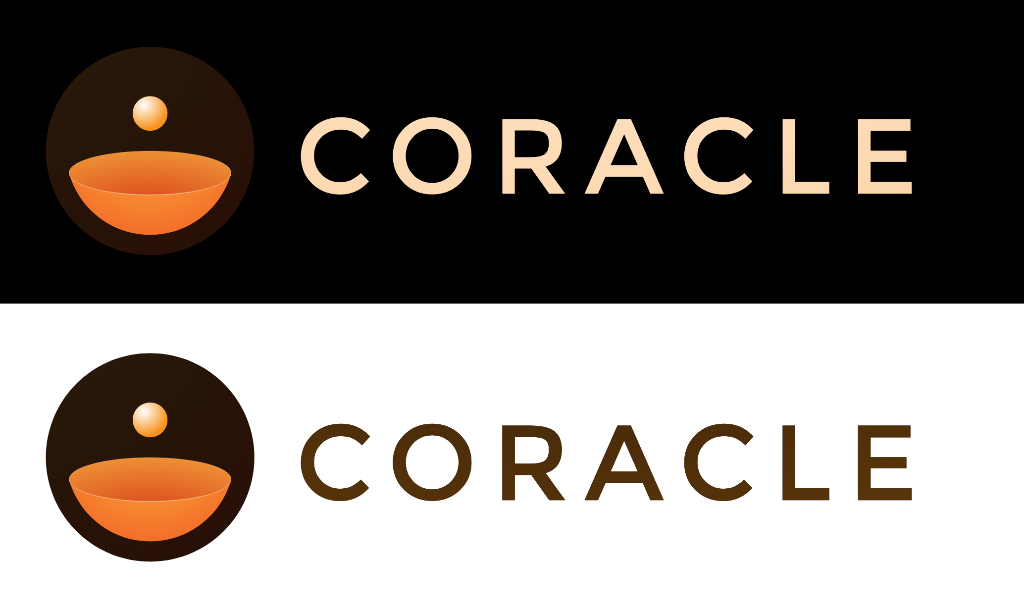
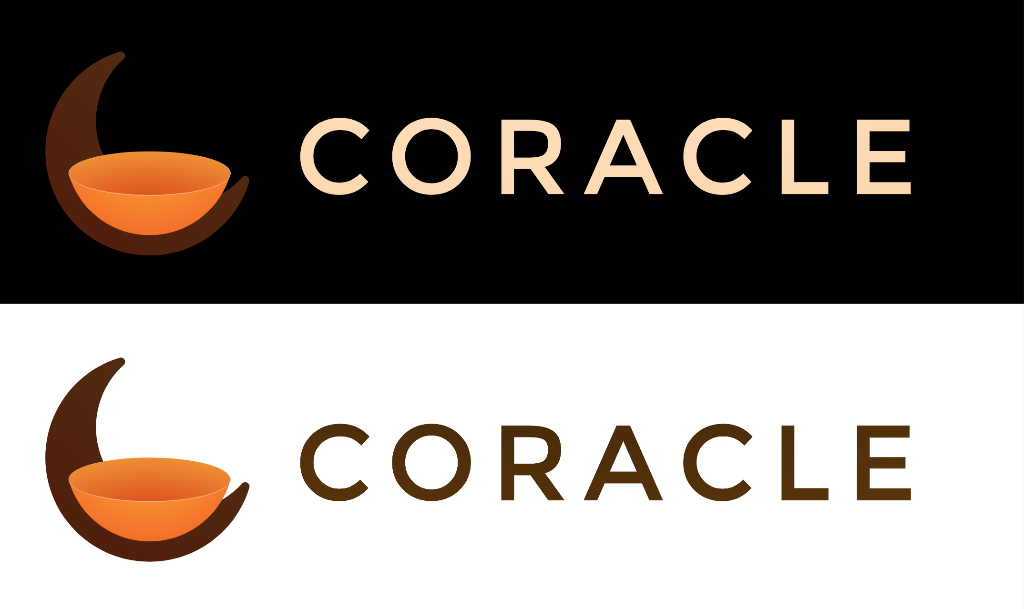
I spent some time on midjourney trying to get it to spit out an improvement. It came up with some interesting ideas, but I'm not sure I really like any of them.

I want to avoid some sterile crap like is currently the trend in logo design. I like the wave/coracle idea I currently have and mostly want a better execution, but if there's a lot of feedback that some other idea is an improvement, I'm open to changing.

?width=673&height=673

?width=673&height=673

?width=673&height=673

?width=673&height=673

Reply to this note

Please Login to reply.

Discussion

Which one is the current one?

The flat orange on white one at the bottom

Can you explain the meaning of coracle nostr:npub1jlrs53pkdfjnts29kveljul2sm0actt6n8dxrrzqcersttvcuv3qdjynqn ?

This may help the designers

A coracle is a small boat made out of reeds, like what Reepicheep sailed in in The Voyage of the Dawn Treader.

Narnia reference ftw 🙌🙌

Some inspiration for the designers.

Nostriches from the nostr:npub1z4m7gkva6yxgvdyclc7zp0vz4ta0s2d9jh8g83w03tp5vdf3kzdsxana6p archives

See the logo is ready 😁😁

😂

Lets be honest this is a yuge upgrade compared to the spaghetti boat 😂

The name coracle is also used for similar small boats that used to be common in Ireland and Celtic parts of Britain

First set of images, I don't even know what I am looking at.

Second set I like the moon on top right and the bottom right.

Third set is too busy for an app logo, especially if it becomes a favicon

Fourth set I'm not too sure of it either.

For me its the second set top right. It's simple enough however there isn't an actual coracle in it but could be viewed as someone looking out into the water from their coracle.

4th set captures the essence of a small boat the best

Why dont you stick with the original logo and sharpen the ends a bit? Im at my kids vbs right now, but when i get back i can make a concept logo using what you got

Like this but with the 3 half circle orelientation you already have and color scheme. I cant access my figma stuff from phone lol

Looks nice, but way too similar to primal unfortunately

drawing tiny things is hard

feel free to hate it. The concept is boat in waves and the boat maintains the signature coracle color when you switch to alternative color theme.

More iterations:

Make the logo look like street art bansky style.

Also try like ancient cave drawing look.

Just playing with some shapes, but I really dig the 🌙 iconography to represent the C, and I admit I never knew what a coracle even was until today.

What about something like this?

Nostr.build is giving me 500's today 😞

@npub1nxy4qpqnld6kmpphjykvx2lqwvxmuxluddwjamm4nc29ds3elyzsm5avr7 what’s up?

Tagging nostr:npub1nxy4qpqnld6kmpphjykvx2lqwvxmuxluddwjamm4nc29ds3elyzsm5avr7 because I couldn’t do it from Coracle.

Not bad

If you wanted to go super-simple and just use one color, it could be more like this.

They all look OK now? Are they back?

Something funky has been going on..

nostr:npub1aeh2zw4elewy5682lxc6xnlqzjnxksq303gwu2npfaxd49vmde6qcq4nwx‘s designs are fire 👏👏 big fan of them both ❤️

I’m posting these with Coracle to wherever the uploader hosts them.

Mine are uploaded via Coracle

Ooo very pretty

One more, because I love simplifying to the most essential shapes.

🔥

Message me with where I can send you the SVG version.

That's ok, I'm going to take the design and run with it. Tweak moon size, boat shape, etc. Might still stick with what I have, but this is very nice

Do you use Figma? I can give you a file with both versions, one with the moon by itself and one resting in the boat, and all the shapes so you can see what works best.

I do, thanks! My nip 05 doubles as an email address

Done.

I’m not seeing where you are getting 500s, although we have had some images not uploading..

I’ve been getting broken images and 500 errors but then the links work a few seconds later when I reload the page.

Very strange.

I absolutely like your original logo: it has personality and distance itself from the easy design trends, then I find it really memorable. I appreciate the fact that a logo should not necessary explain everything, let the user immagine.

You are right, maybe the lines could be a little, just a little, thicker. And at the same time I would lighten the "coracle" text to equilibrate the two elements.

Keep it!

Thank you! Can you elaborate on what you mean by lightening the text?

Sure, I will elaborate a mockup in the next hours.

Thanks for the zap⚡ !!

Worth it 🤙

Above the original logo, below the updated one:

In addition to increasing the thickness of the logo lines and decreasing the font weight:

- Lighter/darker orange shades for interior elements

- Some space between characters

Interesting, thanks. Is that still staatliches? Looks so much different. Are there any other fonts you would reccmmend?

I didn't want to change the font to not be too invasive :) Staatliches only has a 400, so I lightened it manually with a custom negative offset; I can tune it or/and look for some alternatives.

In the meantime, would you like me to share this version with you?

Might not be your style, but I tried a combination of the bowl-shaped-boat, the moon and an aspect of an oracle.

Not possible to upload multiple pictures in one post on coracle?

These are very good! Yeah, adding multiple files is something I need to add.

What font is this?

Montserrat.

One of the only great looking ones where the "C" is as round as the logo.

Ah nice, thought it looked familiar