Hello nostr, can you please give me feedback on our website
Zapping good suggestions
bitvora.com
Hello nostr, can you please give me feedback on our website
Zapping good suggestions
bitvora.com
Looks nice, a quick feedback:
- I would increase the paragraph font size a bit, on dark backgrounds the text is less readable;
- On mobile, I would replace the horizontal carousel with a vertical structure, so the content is immediately visible;
- The menu is absent on mobile
I'm on the homepage and I'd like to know the following before clicking links:
1. How will I receive the funds? Bank transfer, on chain, etc.
2. Do you custody the funds until I withdraw?
It’s good, viewing from mobile I prefer having a list to click into each section rather than having to scroll down. But that’s just me 💁🏼♂️
Using Firefox on Android.
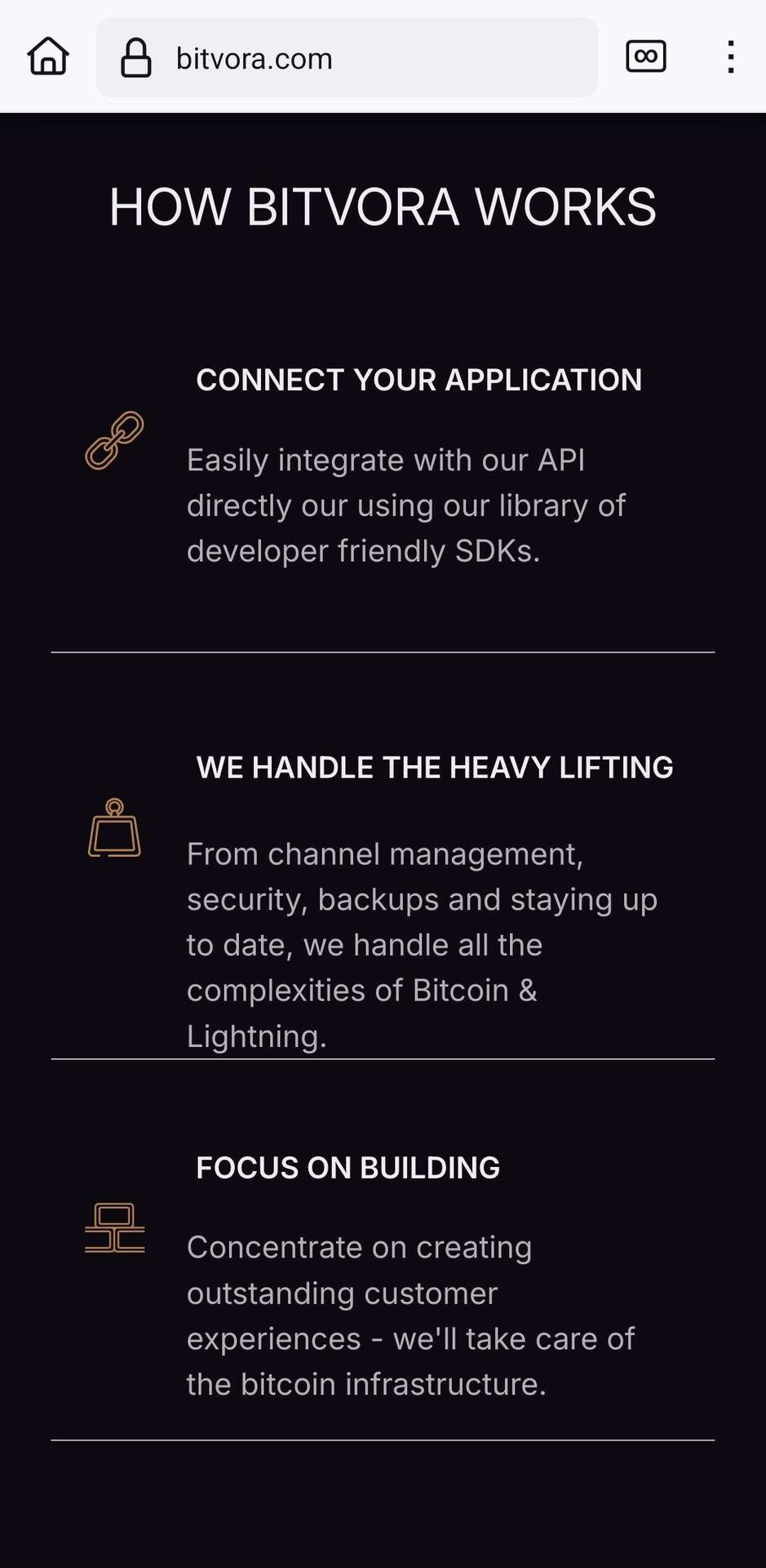
Spacing between the text and dividing lines isn't consistent in the section shown in my screenshot.
Also, the background changes from black to white after clicking the API docs link. I haven't looked at other links yet.
Screenshot goes off screen. Looks a little off. Vanadium on graphene.
Rest looks great!