I upgraded to watchOS 10, and it’s so interesting – like someone joined the team and said, “why do we do *that*?” 100 times.

- Was side button multitasking useful? Not really.

- Was the zooming grid an effective way to find apps? Nope.

- Did we need the clock in the app list? Nuh-uh.

Controversially, I’m also glad “swipe to change watch face” is gone, because I never did it on purpose 🙈

It takes a lot of time, energy, and bravery to execute this kind of root to branch rethink – well done! 🙌
Reply to this note

Please Login to reply.

Discussion

That being said, there are a handful of places I hope will get a little refinement in future updates:

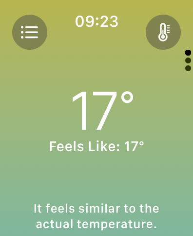
- Weather uses white on yellow/mint, which isn’t terribly pleasant to look at. I’m not sure what the colors are trying to convey 🤷‍♂️

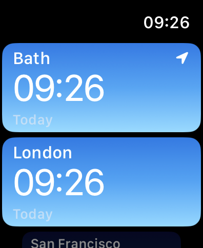
- World Clock uses grey on light blue, which I can’t easily make out.

- Calendar uses red on blue, which my eyes find tricky for some reason.

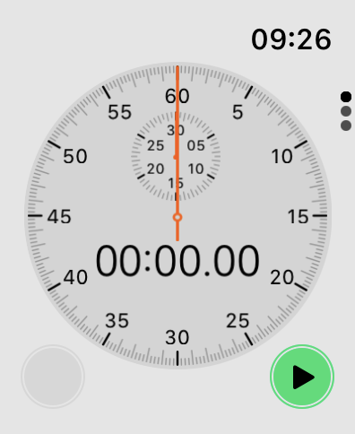
- Stopwatch is always in light mode, and uses black vs dark grey for its paging dots? Hmm.

Anyway, mostly a huge win!