That being said, there are a handful of places I hope will get a little refinement in future updates:
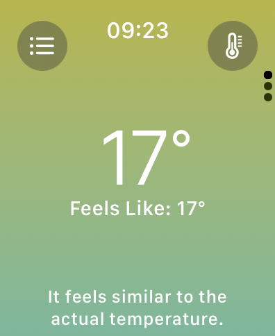
- Weather uses white on yellow/mint, which isn’t terribly pleasant to look at. I’m not sure what the colors are trying to convey 🤷♂️
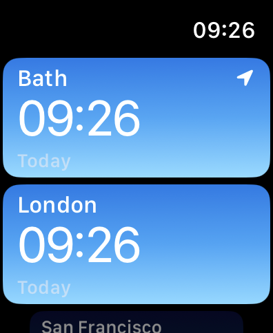
- World Clock uses grey on light blue, which I can’t easily make out.
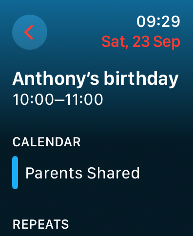
- Calendar uses red on blue, which my eyes find tricky for some reason.
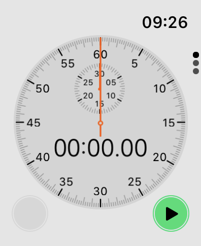
- Stopwatch is always in light mode, and uses black vs dark grey for its paging dots? Hmm.
Anyway, mostly a huge win!