Global Feed Post Login
Avatar
Jon889
7540cba0f117e9a388337b32e86584a619e0de94e5fab0b892c048d080d5821f
Muttering into the void. iOS Software Engineer. Previously did Canopy, NCTabClock, NCFullStatusBar and AutoLSMusicControls (Cydia). 🏳️‍🌈
Replying to Avatar Paul Hudson

That being said, there are a handful of places I hope will get a little refinement in future updates:

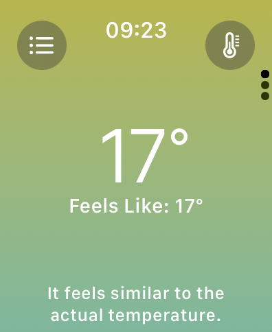
- Weather uses white on yellow/mint, which isn’t terribly pleasant to look at. I’m not sure what the colors are trying to convey 🤷‍♂️

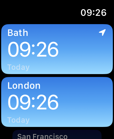
- World Clock uses grey on light blue, which I can’t easily make out.

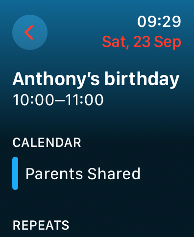
- Calendar uses red on blue, which my eyes find tricky for some reason.

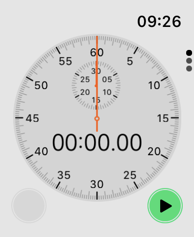
- Stopwatch is always in light mode, and uses black vs dark grey for its paging dots? Hmm.

Anyway, mostly a huge win!

Avatar
Jon889 2y ago

nostr:npub1u24tf7lkhs9wec3fg2xzddfpu49hwlywsdynx568xfflcjcntqasr532pl im definitely missing double tapping the Digital Crown to go back to the previous app though. Could’ve been replaced with double tap and scroll down
Load More