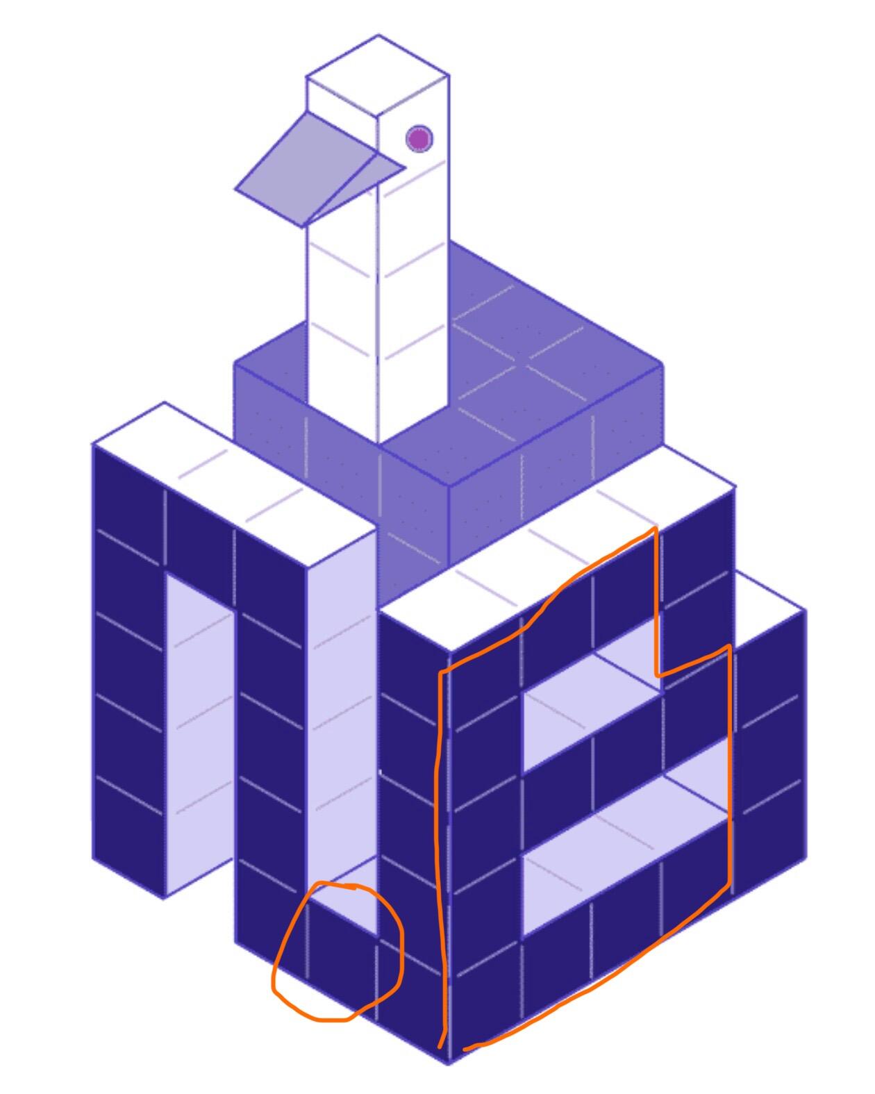
C is really good but I think the letters can be simplified. Maybe the N can just be an upside-down U and not connect at the bottom to the B. The B could also be one column narrower.
c is my fav. i like the voxel design, but agree with others they could all be simplified
Please Login to reply.
No replies yet.