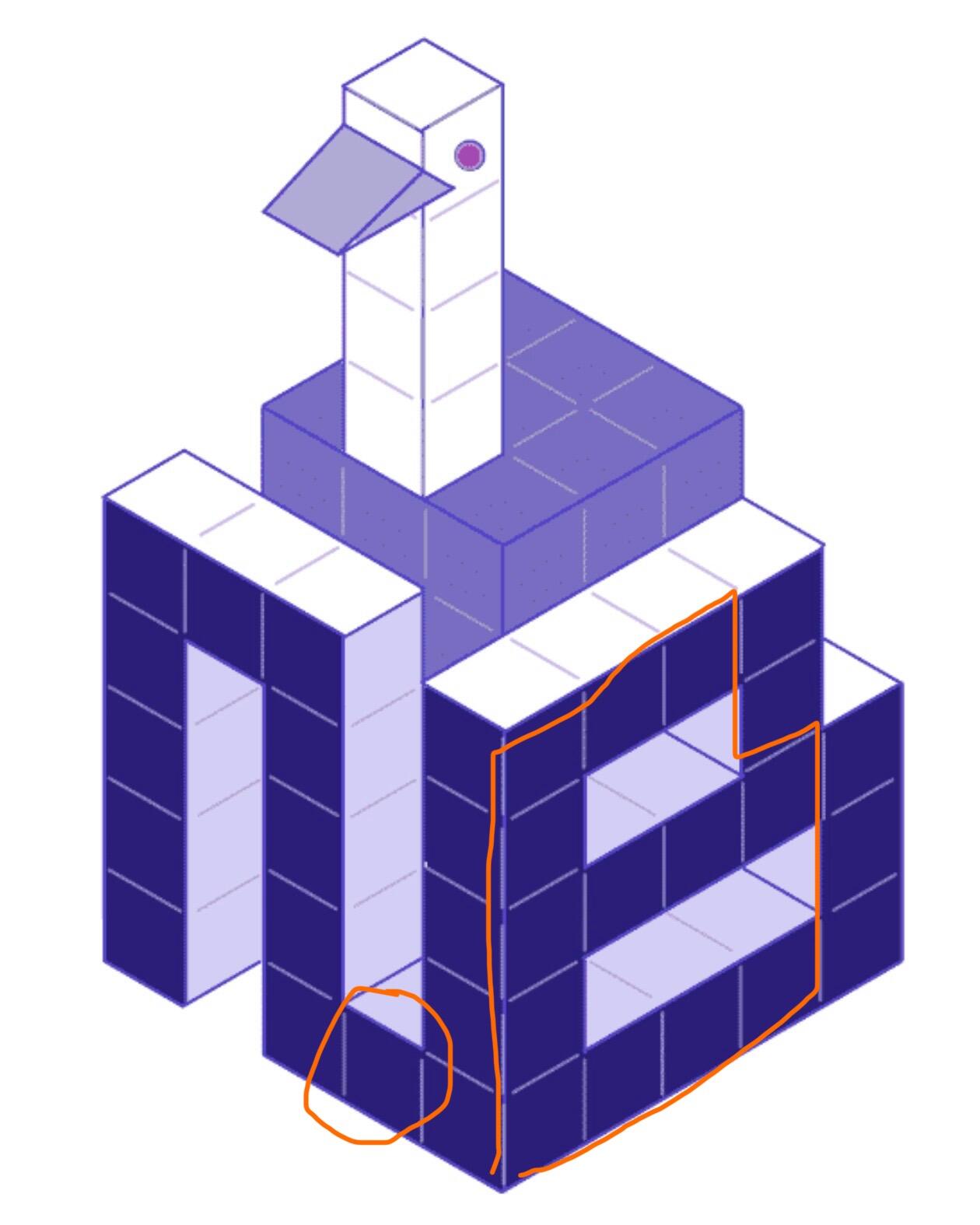
C is really good but I think the letters can be simplified. Maybe the N can just be an upside-down U and not connect at the bottom to the B. The B could also be one column narrower.
nostr:npub1e4qg56wvd3ehegd8dm7rlgj8cm998myq0ah8e9t5zeqkg7t7s93q750p76 is working on a new logo for nostr.build, what do you all like best:
A, B or C?

C is really good but I think the letters can be simplified. Maybe the N can just be an upside-down U and not connect at the bottom to the B. The B could also be one column narrower.
c is my fav. i like the voxel design, but agree with others they could all be simplified