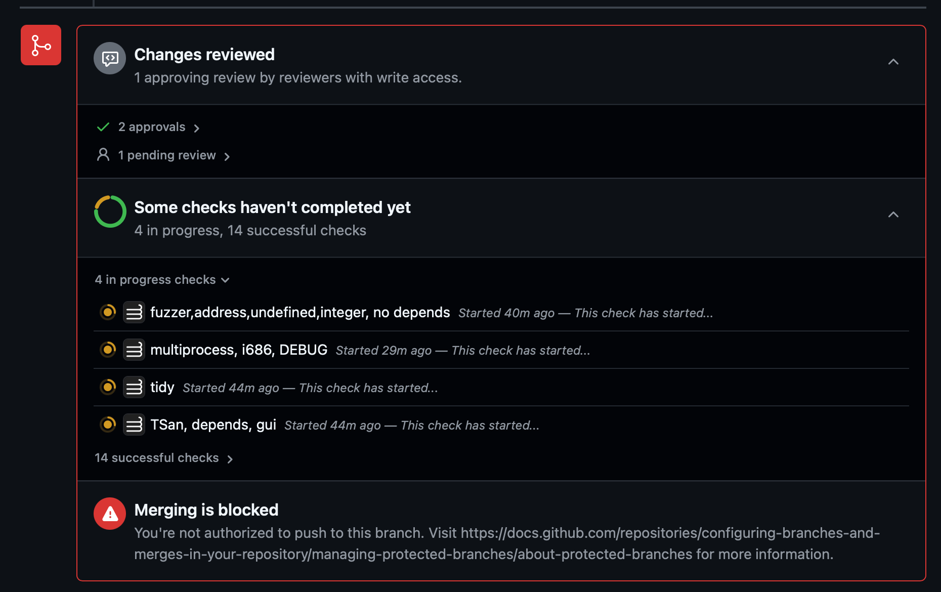
Not a fan of Github's new design where lots of red is used when there's no actual issue.
The fact that someone still needs to review isn't an error.
Yet another idiotically senseless UI change rather fixing and improving actual interactions.
Please Login to reply.
No replies yet.