
Not a fan of Github's new design where lots of red is used when there's no actual issue.
The fact that someone still needs to review isn't an error.
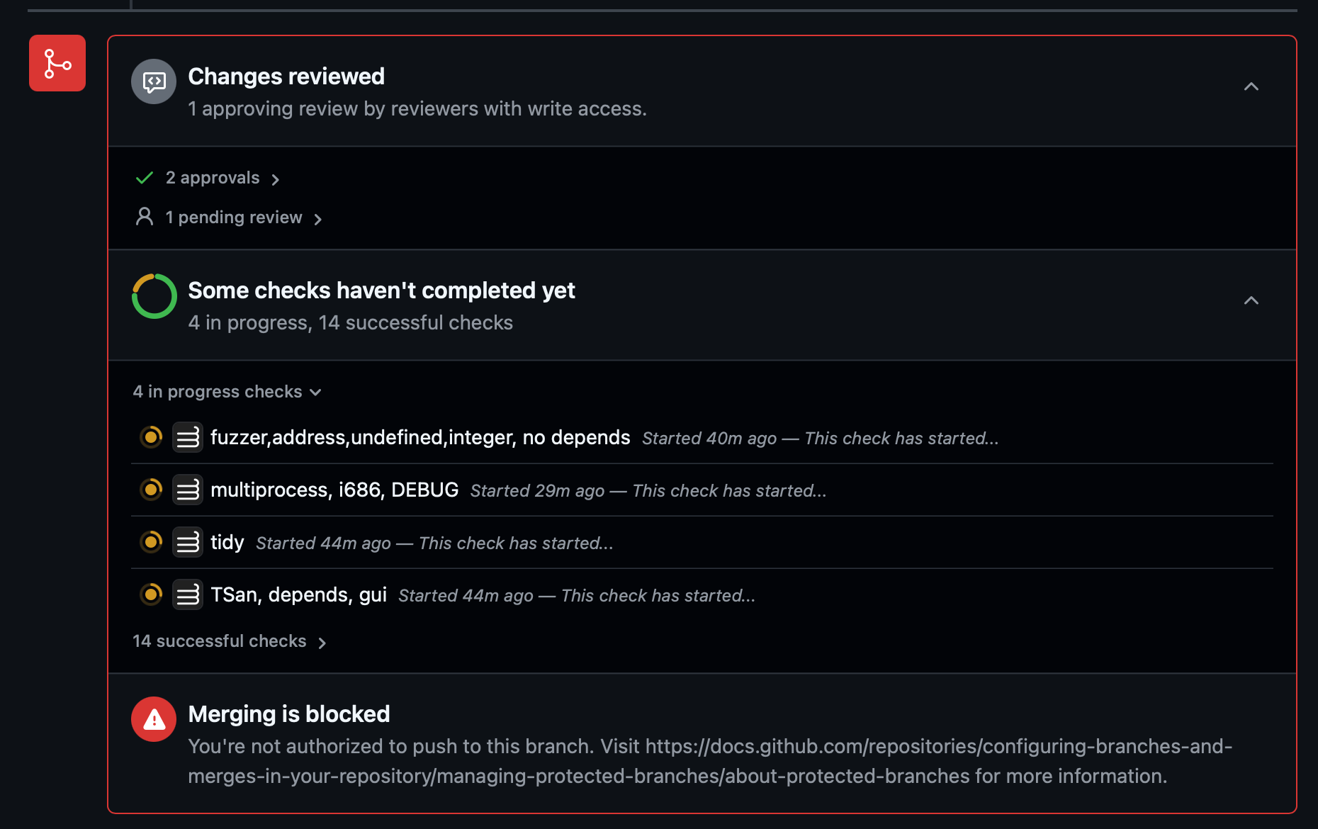
Not a fan of Github's new design where lots of red is used when there's no actual issue.
The fact that someone still needs to review isn't an error.
I agree, everything feels like an emergency now
Yet another idiotically senseless UI change rather fixing and improving actual interactions.