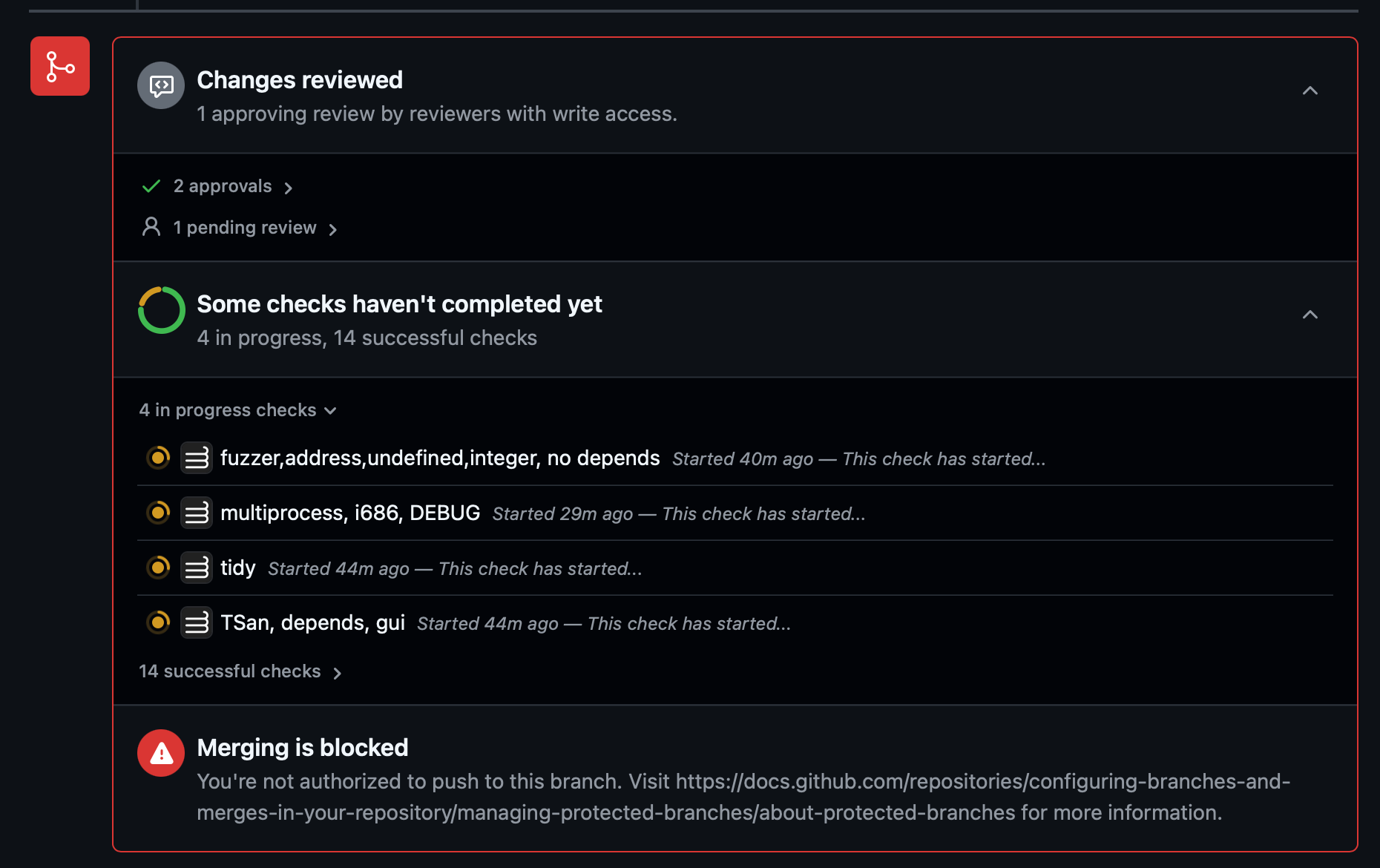
Not a fan of Github's new design where lots of red is used when there's no actual issue.
The fact that someone still needs to review isn't an error.
Try being colorblind, then you won’t even notice it!
Please Login to reply.
I'm guessing whoever developed this was... ?
Maybe, but it looks like great UI to me! 😅
exactly!