Serif for the article.
Sans for the intro.
Serif for the article.
Sans for the intro.
I like that. Is there a specific reason why? I want to understand the design logic.
Maybe because the horizontal lines make it easier to read?
Just checked. Serif easier to read at smaller scale.
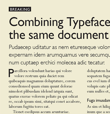
**Serif** is the best experience (for most people) for long form reading:
Articles, Book chapters, ...
**Sans** is great for shorter, more chopped up types of reading:
Posts, Wiki entries (with all the links etc...), Descriptions, ....
Many are critiquing Serif as inheritance from the printing press and so on.
Plus, a lot of research has gone into maximizing readability.
Lexend — Change the way the world reads. to name just one example.
But you don't see many customers actually preferring those fonts. Readability isn't everything. Serif has a great vibe going for it and fonts like "Lora" are very much readable enough.
Left: Inter + Lora VS Right: Lexend

Which common fonts are the left ones closest to?
They **are** the common fonts lol.
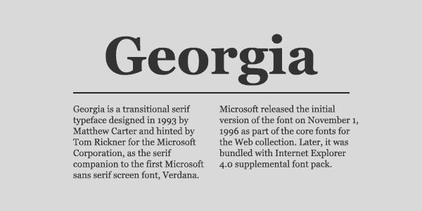
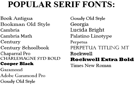
Lora, Georgia, Cambria are some that I'd recommend.
Ooooh, nostr:npub1wqfzz2p880wq0tumuae9lfwyhs8uz35xd0kr34zrvrwyh3kvrzuskcqsyn look, pretty! That looks very neat and a bit classic.

I love that for a body font.