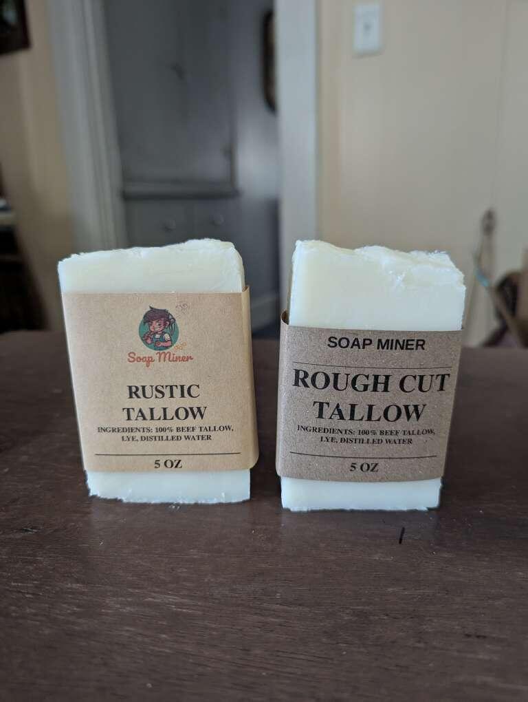

Consider a different font for the branding on the right. I like the rest of the look, it just isn't clear that soap miner is a brand on that one. Maybe try the font from the left without the image.
Consider a different font for the branding on the right. I like the rest of the look, it just isn't clear that soap miner is a brand on that one. Maybe try the font from the left without the image.
No replies yet.