🚨 Sats giveaway 🚨
First 21 Nostriches that respond, and repost this get 210 Sats. Want real opinion.
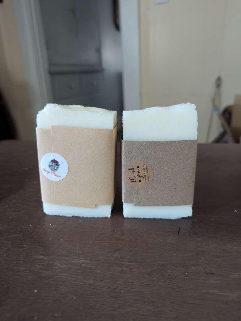
Going to try new packaging. Which is better, more attractive, a superior quality?
Left, or right? 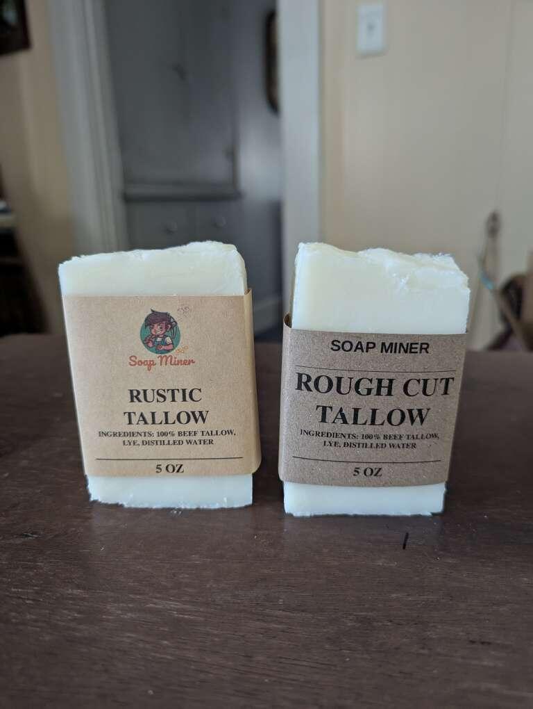
🚨 Sats giveaway 🚨
First 21 Nostriches that respond, and repost this get 210 Sats. Want real opinion.
Going to try new packaging. Which is better, more attractive, a superior quality?
Left, or right?
Keep the sats. I like the simplicity of the one on the right.
Just realized this was a repost 🙄
Depends on who this is for.
Love the little logo from the one on the left, but the right one speaks more to attractive, superior quality and give you a more “serious” brand. 🤠
I like the one on the right.
Left looks good 😀👍
Left ✅
The right version looks more clean and valuable to me.
Right.
Left
LFG!
Left 💯
Right
Left
Left. Good mix of text and imagery.
Is it possible to make the logo bigger from the one on the left???
Consider a different font for the branding on the right. I like the rest of the look, it just isn't clear that soap miner is a brand on that one. Maybe try the font from the left without the image.
Right looks nice
Left
Right
Left. I also think stacking the ingredients would be visually appealing to display how simple the ingredients are.
Got any of them sats mate?
Right