New https://njump.me homepage just dropped
https://video.nostr.build/1b28e51e45ed6a856e1a658f11b87d27bd551a7dcd0d8cda356f6b6e4e27d6c8.mp4
Well done!
Nice!
On mobile, the text animation sometimes goes to two lines, which jumps the below text and hurts readability.
Nice, just one thing 😅
Hahaha damn!
But the animation doesn't work?
I need to put a safe default if somehow js is disabled, thanks for pointing this out!
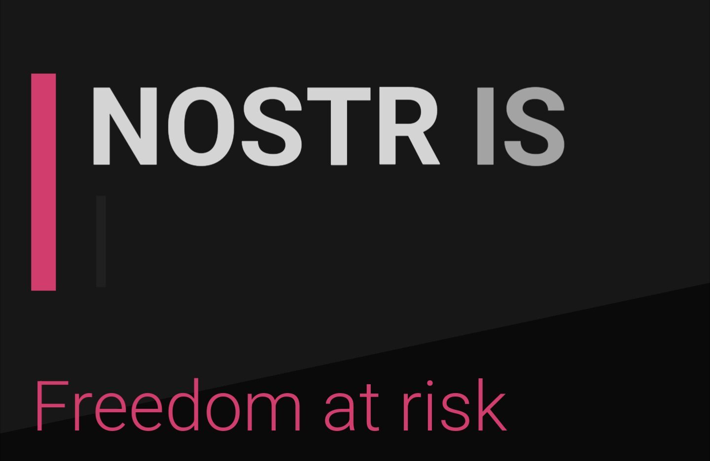
It does work, but for the first couple of seconds it shows this before the other words appear
Like this
Could reframe as
“Without nostr freedom is at risk”
Added a no-js fallback and reduced the initial delay, thanks 👍
Less text please. Make it like Google's homepage.
I understand your pov, but lately I have been fond of the thought of "making long-format content great again". I also love text as a design element.
njump never works for my npub, my pfp doesnt show up and it shows my old nip05 (primal)
It works just fine for me: https://njump.me/_@Bac0t.my.id
that is weird, it works now, but it was like this before i refreshed it 🤔

Illustrations look neat, nice to see a more original style.
keep an eye on Mostro.network as exchange no Nostr.
this looks great. fantastic job.
Looking good. My personal wishlist:
- Make the profile pages super clean, simple, visually appealing; hide the detail
- But make each core element of the profile clickable to learn what it is, how it's different, and why it matters (e.g. This is an npub. It's like a username, but better. Here's why that matters.)
- It's then something I'm eager to share (instead of primal.net/shawn) as a way to a) provide my profile with options as to how to open/engage, and b) gently educate the viewer about nostr.
🙏
Thanks for the valuable feedback!
A contextual help is definitively something I want to integrate. I like very much the "gently educate" philosophy.