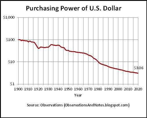
When people see the chart showing the USD decline in value over the last century, they get the impression that it can’t possibly fall that much further and if it does it’ll take a century anyway.

Someone needs to make a chart showing only the last 5 years.

Reply to this note

Please Login to reply.

Discussion

Just need a chart that shows % drop each year instead of cumulative lose of value over time or cpi and real cpi overlaying purchasing power drop on log scale.

Someone should clean one up from 1900 to 2024

It's not slowing. It's only going to get worse now that we past the event horizon of the debt death spiral.

Not lookin good that’s for sure