Nostr pals 💜
I need your help choosing a thumbnail.
A - script font
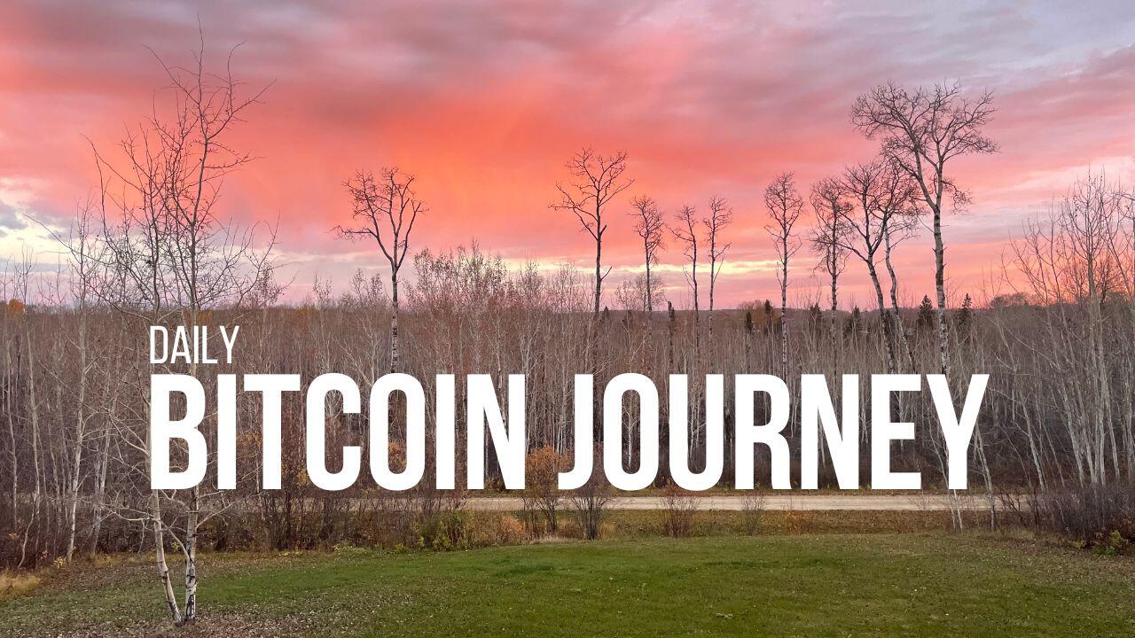
B - small “daily”
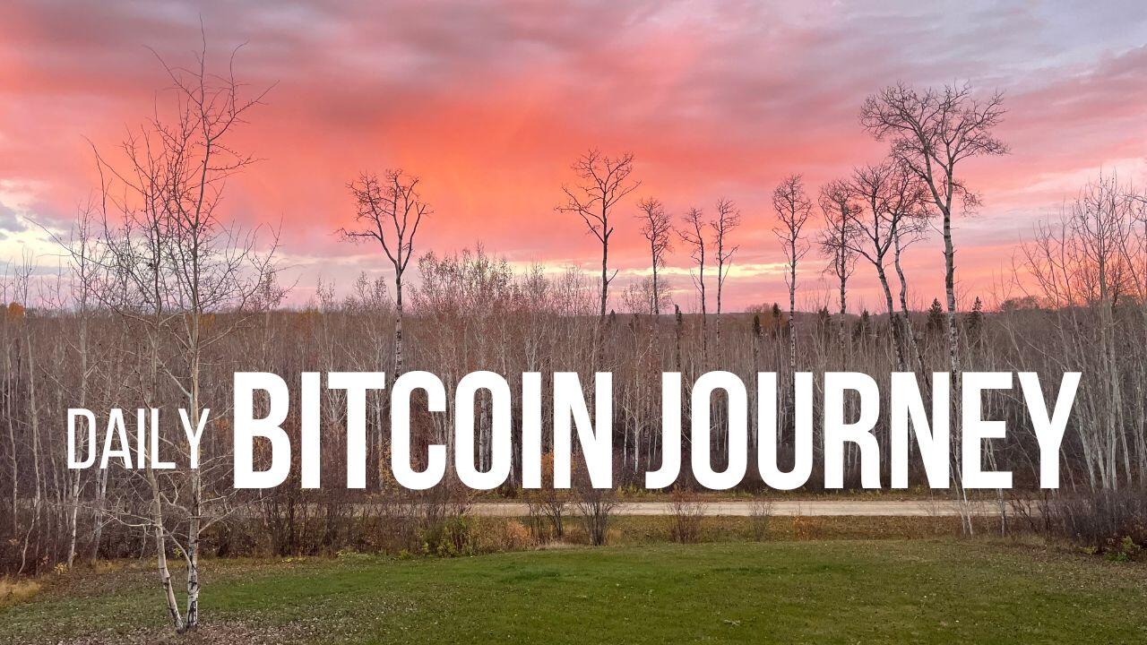
C - medium “daily”
D - they’re all shit 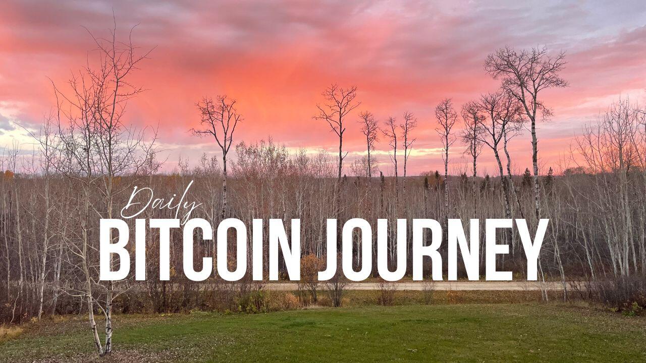
Nostr pals 💜
I need your help choosing a thumbnail.
A - script font
B - small “daily”
C - medium “daily”
D - they’re all shit
B.
B.
I like #2. Maybe try another color font other than white to give it some pop. Maybe orange?
A 👌
B is the best imo
B is nice.
2
B
A
B
Script/font combo is played out.
The small daily is okay but I feel like it would be better centered, maybe?
C is my least favorite, maybe if the word daily was anchored at the bottom instead of floating?
B
Script, but make it larger.
#2
First the script is wack. Second is good but third wins because it looks like the title is moving forward on a journey.
You’re welcome that is all.
🧡🫂💜🔱
Wack. 😆
Perfect. 1 it is!
B
A
People are paying a lot of attention to what you've written.
Added to the https://nostraco.in/hot feed
if the emphasis of your content is the fact that it's on daily then daily should be much more prominent, not an after thought. probably B.