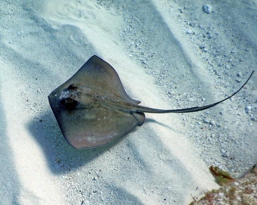
What do you guys think of this stingray logo? #roastme

What do you guys think of this stingray logo? #roastme
nice
Looks familiar, a little too familiar. Id say change it or the colors at least. The resemblance caries baggage you probably dont want to inherit 😅
Looks way too much like a Microsoft product by the colors haha. I'll need to switch it up.
I kinda like it! It reminds me of the Twitter logo a la stingray🤙🏽💯
Looks very twitterish
That seems like the common vibe. My main goal was to see if it looked too much like something else, so thanks 👍
Shit look like the twitter bird if it took a nap ! Do you need a new ting bro ?
It's quite good tbh
I love it
Looks good but missing tiny something unsure what
Also perhaps a different shade/color
Reminds me of a whale 🐳
yes I like it a lot. take this with a grain of salt I hated crayons but it looks to me like he's BRAKING with his wings to a avoid hitting wall.
has he come to the edge of the nostrverse fishbowl
beautiful
I like it. Esp, colors and the tail.