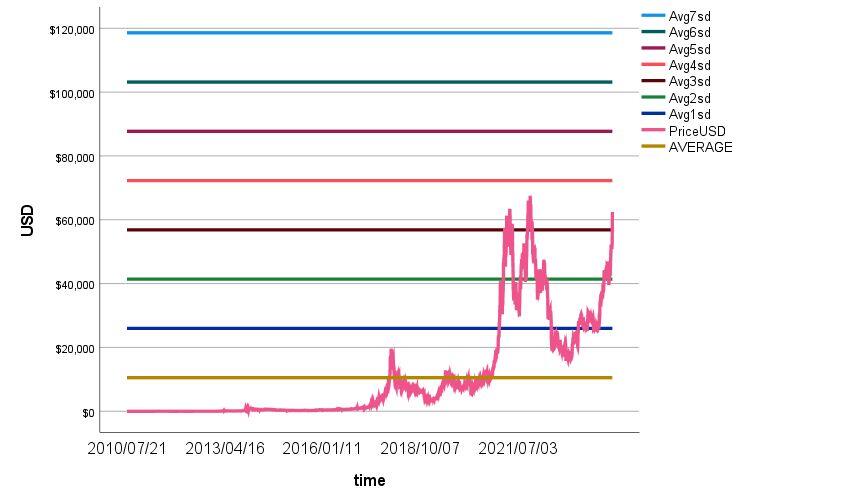

What is this graph supposed to say?
I don't care what was going on in 2013 or 2015, Bitcoin is a fundamentally different thing now.
What is this graph supposed to say?
I don't care what was going on in 2013 or 2015, Bitcoin is a fundamentally different thing now.
Suggesting a phenomenon known as "regression toward the mean".
Although average is dynamic (changing day to day), price will tend to regress toward the average
Going back to the year 10,000 BC, the mean price is zero. Do you think it will go to zero?
Lol, unlikely but not impossible.
Price is too high is what the graph says. Correction evident. When? That's a different question
Correction not evident. There are no future prices that are "evident". That's not how evidence works.
We may never go below 60k ever again. That is entirely within the realm of possibility.
If it follows regression toward the mean, then it will correct towards the mean.
10k? You're seriously expecting 10k? When?
Make a price prediction, bro.
I think we'll be over 100k by end of year, and we will spend no more than 2% of the time in the next 10 years under 50k. No reversion.
How bout you?

Not interested in making a price prediction? You wanna preserve your ability to claim any possible price change as validation for your kewl graph?
Your graph does not show a dynamic average, it shows a static average. There are mathematical tools to show a dynamic average. Why share this static average? It's basically useless imho.
Dynamic = moving average. No other sources I know provids all time average. Why not? Because you can look at the 200-day month whatever moving average on your own.
All time static average is a reference point. Not useless overall, but useless to you and that's okay