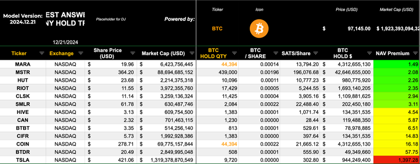

There isn’t much “signal” to read from that last column on the right, as every company in that cohort has a significant OPERATING business relative to its market capitalisation.
MSTR is the only pure play (op biz less than 2 percent of mkt cap, the rest is “bitcoin treasury”)
If you had a dozen OTHER (nearly) pure play “Bitcoin Treasury Businesses” then that chart would be valuable for comparison purposes.
Just sayin 😉
