These are pretty basic, but show the process. First few versions can often be way off. I just redesigned Mark Twight’s logo - he a cool guy. https://cdn.nostrcheck.me/0c9e5e17fbdf555ef41daf3c3a196749c848f9c791966f30fae5e4c0480e870b/00e7812dd3752a72c6eed6780c9994e9ff41deee9cd8421730b038ac3f7c64e0.webp https://cdn.nostrcheck.me/0c9e5e17fbdf555ef41daf3c3a196749c848f9c791966f30fae5e4c0480e870b/22eead0772867ed0c895e8bc604f25b533030afd256144ee8df151fb8590f899.webp
Discussion
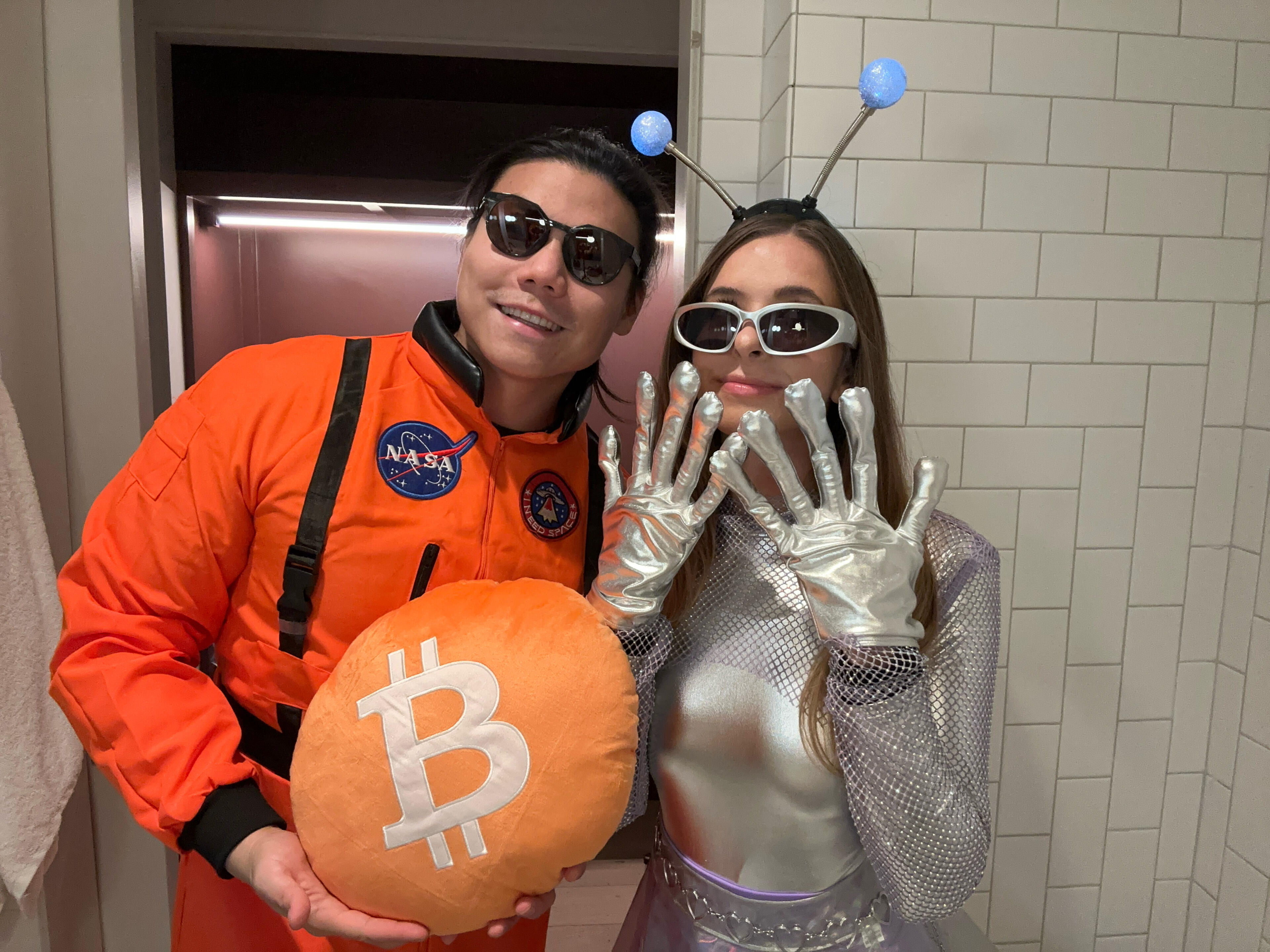
What do you think of the bitcoin logo. If you could improve it what would you do?

