
How do you guys like the ZEUS PAY logo? 
Discussion

Me gusta

😍😍😍

Nice 🤙
Looks like it belongs on playing cards in a casino

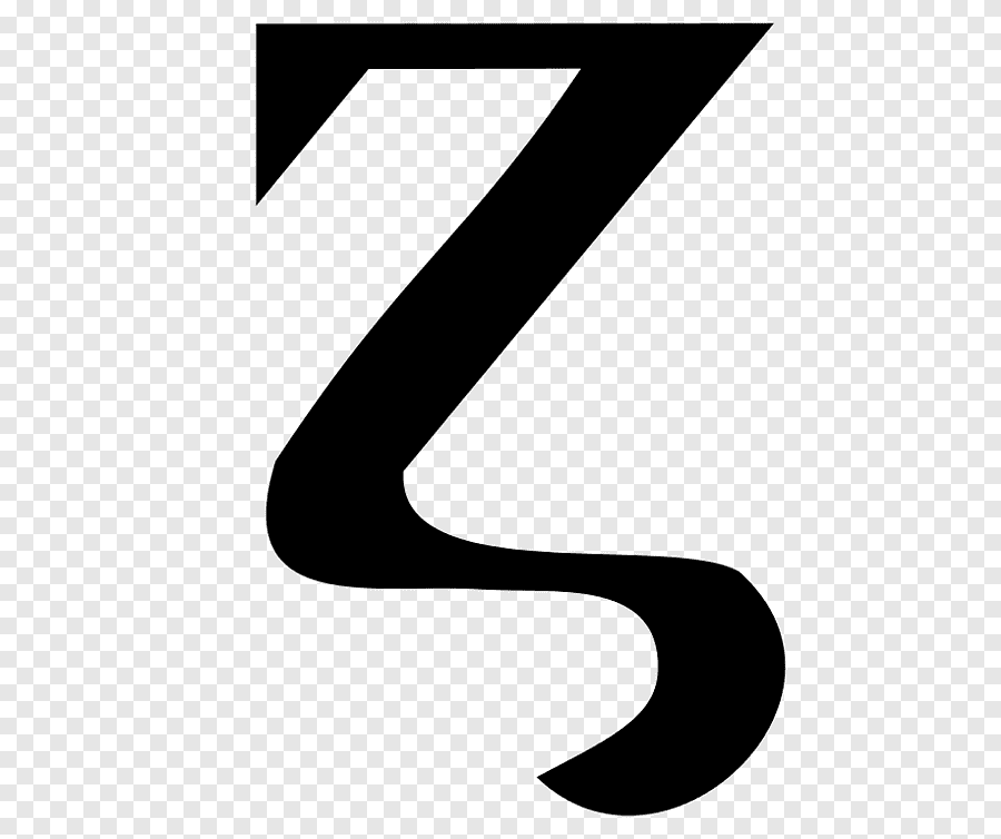
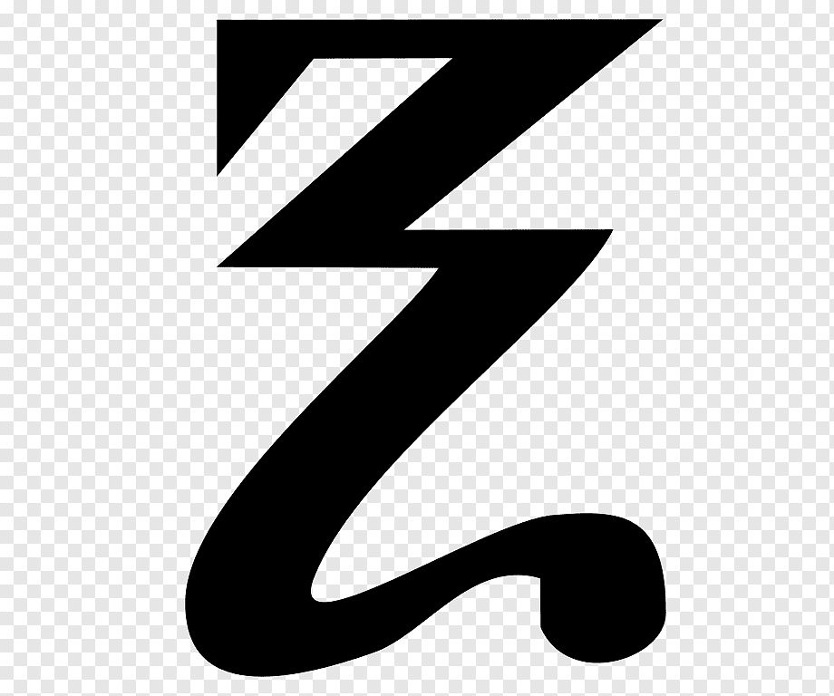

Took me a sec to realize it was a Z 😂 it’s great, love it. Reminds me of zelda a little
Where's zeus? 😅

Dig!

Looks nice.
But on first sight I did not recognize the letter "Z" in it.
It wasn't until I saw the name "Zeus" that I realized it.
Thought it is some kind of a slash "/" surrounded by some other symbols and connected it as something related to coding.
I guess coding topic contributed to this logo. :)
For my taste it has to be a little more clear that it is a Z.
But yeah, just my little opinion on this.
In the end it doesn't change the fact that your app works great for me.
Keep up your awesome work :)

I like it. ⚡⚡⚡

Not sure

It shows a company getting serious, wearing suits and looking nice.
👍

It's a fashion statement. ⚡️

I'm not sure I like the sides, Z looks great tho

Looks like something I would love to have on some merch!

sides are different style with Z which isn’t as nice

Will look great as a watermark under my zeuspay qr code

needs a rework