
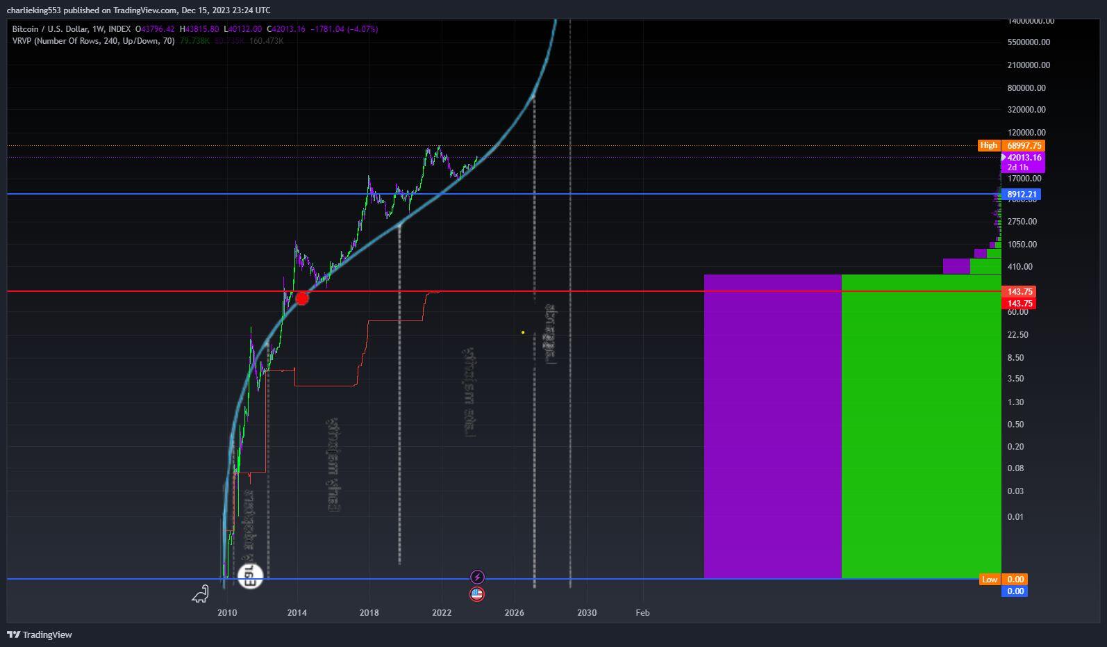
here is a fun chart. scurve adoption of bitcoin. with visible range volume profile on the right. btc supply schedule going to plan????? dont mind the dot in curve. grabbed it off the interwebs. Price + adoption curve
 #m=image%2Fjpeg&dim=1594x931&blurhash=i65%240qD5YW%2B.DgUO*cLhmvD4u2vqJxx%5EiQPbvYS%5BMeyVrfOPx%5Dd%7BPJrNb%3Bu2VGTU%24oMxgtr4O%7EnUnit7jbkBbGjIbXjckB&x=a8b800dbf9d4f5e622fa111dad9914c5438aeb46080f47058c5ad4dd736b43bf
