I don't like the idea of having a logo, but if we are going to have a logo, can we have one that doesn't have a default color and works with all colors?
Discussion

why does a protocol even need a brand/logo?
we just talked about how we should focus on geeks and push the notion of normies further, and now we are trying to brand a protocol
why?

Because it can be useful to know that the new app your are looking at can be used with the same Nostr account you already have and probably play nice with other apps you are using. This improve the network effect.
Think about it like a "powered by".
what's the demographic here?
techies will care about the protocol itself, not the branding
full-on normies won't even know what a protocol is nor how it works, and will just use the client
or am i being too harsh here? 🤔

bitcoin has a symbol, i think that at some point we will come up with a compelling symbol for nostr, i have no idea what that is but probably someone's gonna spit out some good ones very soon, the heat is getting hot in here... like a sauna

Let me explain what I mean with an example.
You visit a new website, you can have 2 scenarios:
1) Register with email, password
2) Login in with Nostr
For a Nostr user, do you think they have the same appeal? The 2 has less friction, so higher conversion.
For a non Nostr user, see the same logo in several contexts reinforce the idea that this "thing" is sometime valuable, so push to try/learn more about it.

Login with google has the G or Gmail logo.
Login with FB has the FB logo.
nostr:npub1t3ggcd843pnwcu6p4tcsesd02t5jx2aelpvusypu5hk0925nhauqjjl5g4 email protocol had not one, but two recognizable icons: ✉️ and @
A recognizable brand helps nostr in my view.
oh, google's an even better example here, true 🤔💜
yeah, but tell me about the branding of POP, IMAP and SMTP here then
If you don’t want most people to know your protocol, you have 💩 branding like POP, IMAP, SMTP.
Tor has a favorable and known consumer brand, at least among the nerds, and privacy conscious. They also have characters and art in a similar theme - we dont have to bury the nostrich just yet. 


hmm, that tor one is cool indeed
but i don't really know much things built on tor protocol other than tor browser
and i only know of it because the name of the browser is the same as the protocol
like we used to familiarise ourselves with internet through internet explorer

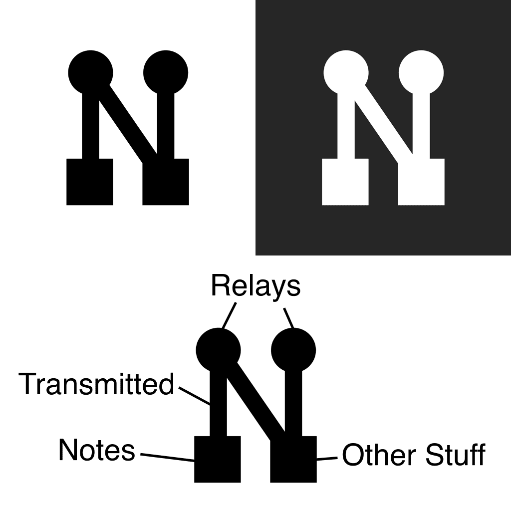
It’s an interesting debate/challenge. I personally think if there’s going to be a logo/icon it should highlight the key pairs in some graphical way.
Iris messenger, and robosats can run on Tor. Relays can run on tor. You can run a node on the network.
Think of nostr as your garden soil.
In there you can plant beautiful roses, fast growing vines, and throw in some compost.
If you do it right you’ll have complementing each other trees, and shrubs with bees that ensure cross polination. The ecosystem depends on a good soil.
i think that the nostr protocol would benefit from being repackaged and presented much more nicely to even start thinking of having such a brand kit, but maybe i'm living in my delulu land
i do agree with you down the line, it's just that it needs to come naturally
Exactly, however it helps if is a neutral, but distinctive, graphic sign
do you think Facebook/Instagram/WhatsApp users how the Meta account behind the scenes works and is set up? 🤔
closest to a legacy social media analogy i know to bring here
also is there necessity for "login with nostr" when nsec could eventually become as essential as your personal id code, which you could login with
"login with nsec"

I’ve actually been thinking on it for a while, and was going to do a bit of a longer write up on this:
I think going forward Nostr will flourish as a “login” like Google, Apple, etc. Normies won’t care how Nostr works, but it can replace log in with Google and have more benefits than a Google account offers due to the shared social graph.
Clients will become the “websites” and needs will become login details. At least that’s the way I see it. The nostr protocol will fall in to the background in the same way that no one really knows how email works, other than you can access it from multiple mail clients if you can log in
I’d love to hear other people’s thought on this
Google/Facebook/etc users well know that they can use the "Login with...", and spot them immediatly because the button is graphically recognizable and tied with the company name. No need to know all the tech background.
Given that "Login with nsec" is bad on all the web contexts, and maybe also for apps in the future (we will have signer for that), why add another brand when we have "Nostr"? It only dilutes the effectiveness.
Nostr is both a protocol and a social/functional layer, you need to know that it exists, you cannot hide it.
bitcoin does, nostr is jealous
why don't we just copy bitcoin and do an N tilted to the right like Bitcoin, except in purple?
or maybe a lower case N
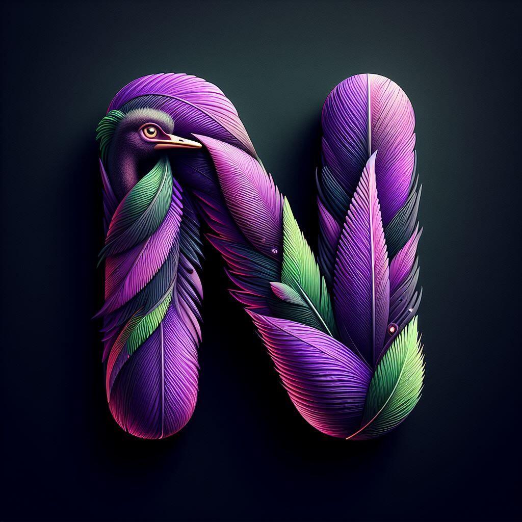
i liked the lower case N with the inverse ostrich head in the middle
nostr is more than just bitcoin
i'd prefer to keep them separated
bitcoin is just a payment method here, you wouldn't brand something based on the currency you use within it


Same reason we have a #Bitcoin logo: for name recognition

It doesn’t.


How about everyone uses whatever logo they want and see what the market shakes out. Why must there be an "official" logo and who would decide that, anyway?
THIS. IS. NOSTR.
🤙🏼


that'll be a hard no.

You mean you don’t like the HTTP logo?

No! Must be purple!

Algo así ☺️
 #m=image%2Fjpeg&dim=640x1024&blurhash=%5E7GuBsBU%3DaJ-5UNa%5D%3AC5rridxts.02Kh0M%3BN%237r%4001rr1f%5E4NGVtk*%3A%2B%5D%2Cj%5BJCjtad%40%5D%7B%7C6*S5TI02%2BvcD7K%25xOrGES%23S5KN-nNx4VK3%3Dxoz%23owJ&x=39c8ef7a90dabb983f8d0a37e3938e1949c9a38ecd408ea99831fb127178d025

I struggled to figure out how to represent #nostr on my personal website. I ended up just using a globe icon. Which I don’t love, since it doesn’t feel like users will understand the purpose behind it. However it was the best option in a list of bad options.
Totally understand not wanting a logo/icon. But just wish there was a better solution than what I did there.

It's okay. Nothing is official.

Black and white it


As a protocol, we probably do not need it. The client app does.
In fact, the HTTP protocol itself has no logo at all ¯\_(ツ)_/¯


The N logos will be the best design for that

Your post is causing quite a stir.
Added to the https://nostraco.in/hot feed

There already is a color and it’s purple!

Mi mejor logo
 #m=image%2Fjpeg&dim=1024x1024&blurhash=U58pvMD%240JtR%5E-ScITaL0Jxc%3D%7ENEI-ryxtXg&x=6ae0badc471e4b911ded2e79b2f7cec2ab6b2cbbe152359835f227b70f6e0ebf
Why not just the word NOSTR choose a font and then any color 🤷🏻
Like a NOSTR approved badge or something for all the clients?


Sure, as long as the logo is clearly recognizable, so we can either use the default icon of the nips repository (which I like) or the term "Nostr" itself (like Google does). But there's no way to avoid font design when using letters as your logo, and almost all companies that use letters as their logo have their own fonts that they use exclusively for their logos, and they retain the copyrights to the fonts as well.

Not sure if a specific logo is needed when you have a purple nostrich mascot that you can make infinite PFPs, badges, icons, etc. from.

no logo pls

most protocols don't really have official logos. i love our nostrich, but in reality, we don't need to have an official protocol logo. we'll have recognizable brand/client logos though.

nostr:note1d8u7jdt8pyfjepv507mzyy2uv7anlnazpsltq4uuplg4ncad6ueqqqfz8j

Basic idea