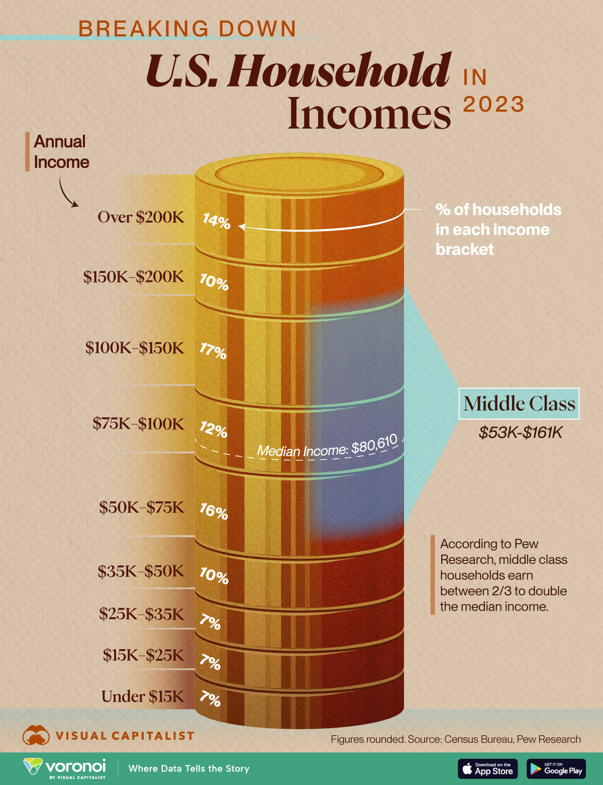

I don’t like this graph. It’s almost useless.
The cohort spans are weirdly sized (10k, 25k, 50k). And the coin stack is being abused for graphical effect, simply unrelated to how much money the cake is made of.
This trap is called “glass slipper” on callingbullshit.org https://m.youtube.com/watch?v=59teS0SUHtI
