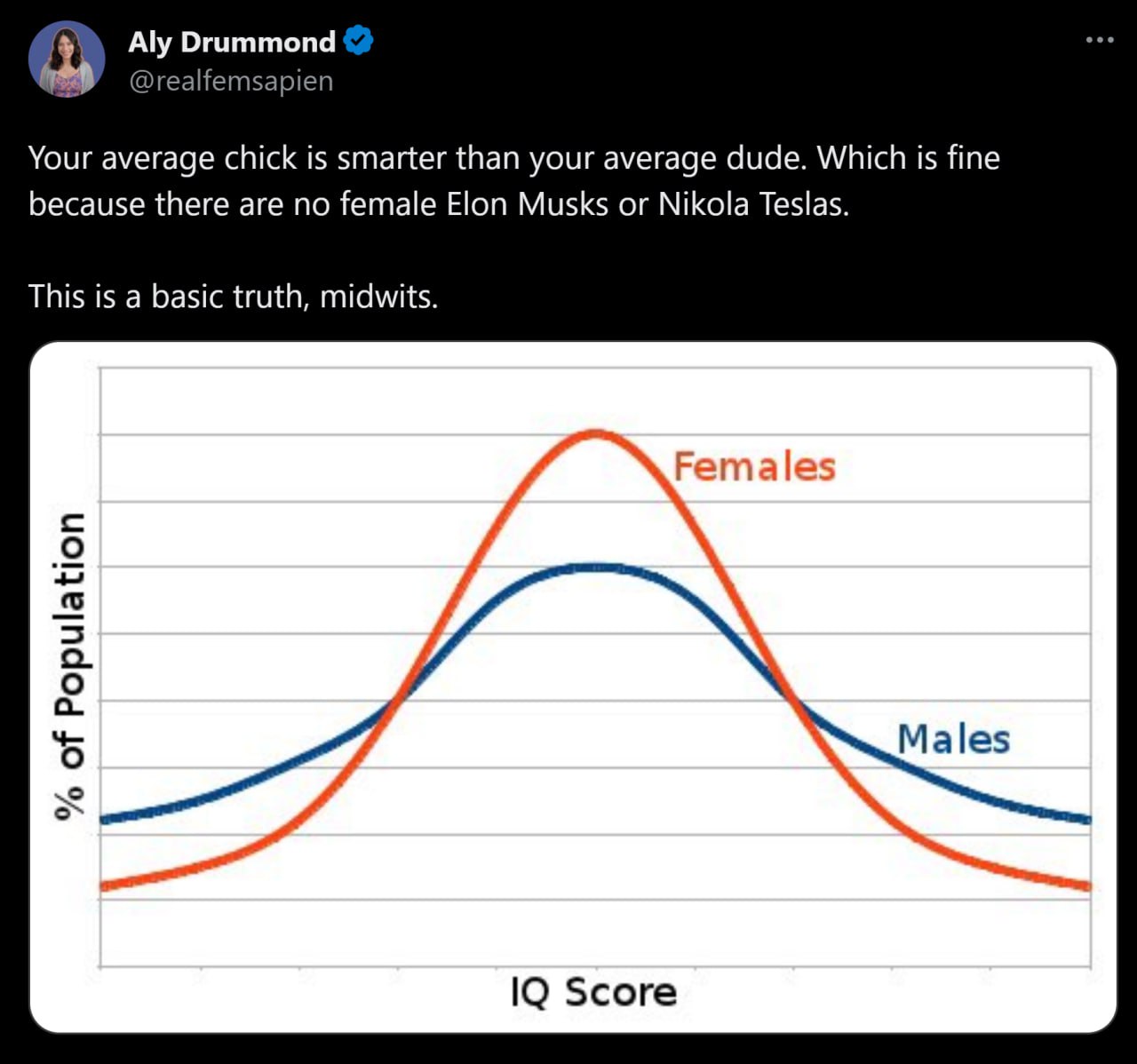

No I think they're just that stupid and grabbed the very first graph they found on a search. All those graphs are totally and obviously wrong (or at least misleading). You can't have two bell curves of different amplitudes since a bell curve literally a standard distribution.
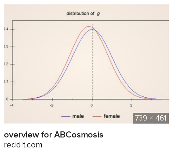
Bell curve comparisons need a chart like fig2 where you have two standard distributions offset from one another. They can be narrower if they represent different population offsets, but they should always be the same height.
I don't care if any of these are true; didn't bother clicking through the links. It's just interesting how stupid people believe the very first result a search engine tells them is true.