Y'all like my new labels?🍷
(On the right)
Now to wait a week. nostr:nprofile1qqs2gndun24r2utk5l20tscsdprw5zttvm0qk58w8xhl2ja2kmzt7jcpvemhxue69uhkv6tvw3jhytnwdaehgu3wwa5kuef0dec82c33x5ehsmt90q6ry7p5vd5xge3hx5mksupnwym857rpvaukk6m9dvmhqer8wa6hwepsxu6rjd35v34hj6rp89ensvnj096ns0mzwfhkzerrv9ehg0t5wf6k2qg7waehxw309ahx7um5wgkkgetk9emk2mrvdaexgetj9ehx2ap0qy08wumn8ghj7mn0wd68yttsw43zuam9d3kx7unyv4ezumn9wshsxs66av thanks for the prompt delivery. Looking forward to these
#wine
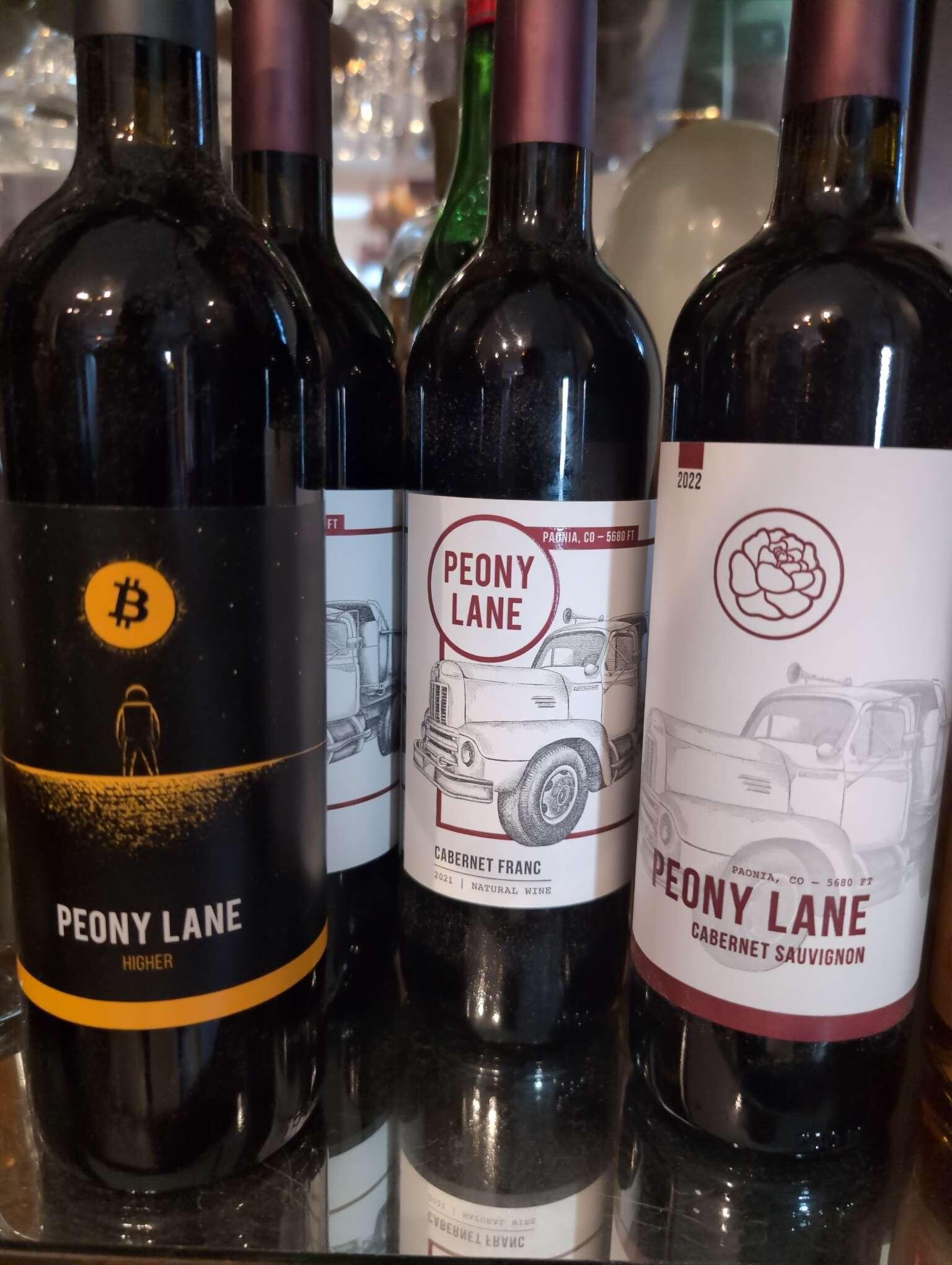
Y'all like my new labels?🍷
(On the right)
Is it possible to combine them? I like the peony in the circle but also like the truck being more visible and detailed.
Anything is possible 😉
Was thinking the same thing darker tone on the last one
So like swap the red peady flower icon for peony lane in the circle?
More so just thought yhe shading of the tractor could be more pronounced
Would stand out I think
💭
Nice

What is the story behind the truck?
It's a 1943 International that my dad got running to clear some junk away from the spot where he built our house. After a few trips it died and they just left it there. That spot just happened to be right outside my childhood bedroom window so I stared at it my whole life and now I think everyone else should too 😉