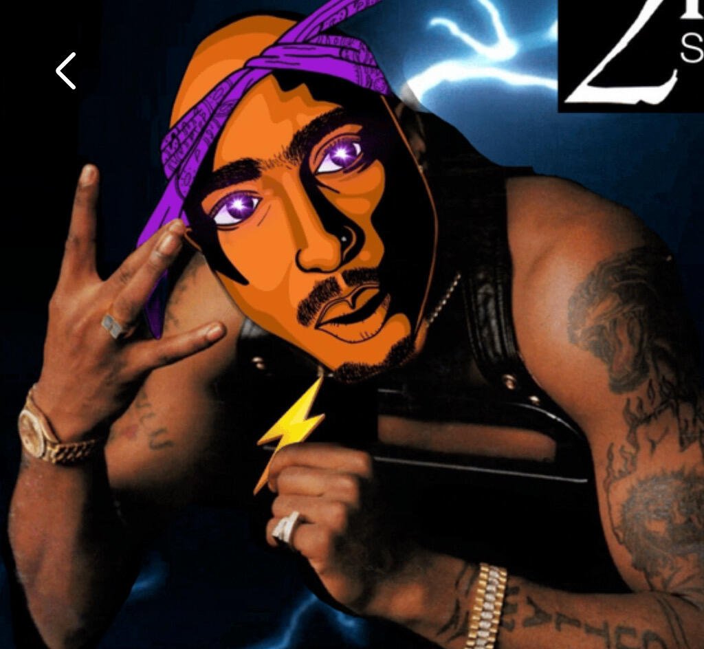
A logo should work in all different sizes and media types. So I’d say there are too many small details for it to be an effective logo. The overall design is fine but I would simply it.
Discussion
If I’m being honest probably a 3/8, needs work.
Agreed. Concept is fine, but execution is too complex to scale well. Many of the details are assymetric too, which is fine when it is intentional but here is does not appear to be.
If you want it to be simpler and scalable but still retain character (i.e. not look like just another modern, minimalist logo) you might consider a direction like this:


