Rate this logo out of 8 please!
It's for a bitcoin advisory company focused on security, privacy, and inheritance planning
#asknostr 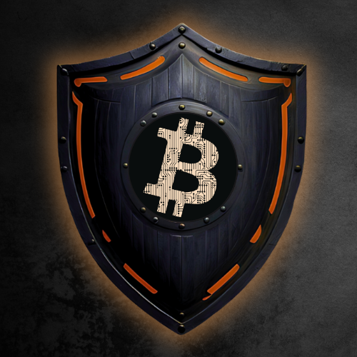
Rate this logo out of 8 please!
It's for a bitcoin advisory company focused on security, privacy, and inheritance planning
#asknostr
8/11
Too complex for a company imo
Yeah it wouldn't be our only logo - we would have other versions depending on what we're using it for
Good feedback tho thank you!
5 out of 8.
The right leaning Bitcoin symbol on a vertical shield is not working for me.
Perhaps ditch the Bitcoin symbol for a keyhole (to evoke the eventual unlocking of the inheritance).
A logo should work in all different sizes and media types. So I’d say there are too many small details for it to be an effective logo. The overall design is fine but I would simply it.
If I’m being honest probably a 3/8, needs work.
Agreed. Concept is fine, but execution is too complex to scale well. Many of the details are assymetric too, which is fine when it is intentional but here is does not appear to be.
If you want it to be simpler and scalable but still retain character (i.e. not look like just another modern, minimalist logo) you might consider a direction like this:
8/8
You really want your logo to be simple, reducible to a couple (or one) colors, vector-scalable, and different from the 1000 of other btc logos out there. This is a cool picture but not a usable logo.
Solid 7 bro, maybe try a lighter color background
I don't like it very much I'm sorry. 🤷♂️ 4
Logo should be way more basic
0. Has no mention of trump and q
9.2
nostr:nprofile1qqs0x4sg8v2xzwg8dfcjpcpj08pggchz62wxlu2gga2a9zwq42wl3wsprpmhxue69uhkvmpwwp6hyurvv4ex2mrp0yhxxmmdqy2hwumn8ghj7mn0wd68ytn0d3mk2tnvd9hxkyf27kr is as about to cry today on live stream
I love it. Give it a 7/8.
The B should be orange 🧡