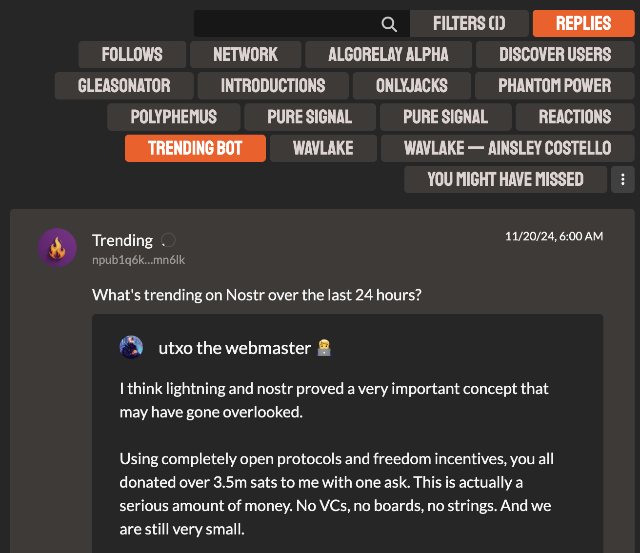
Do you hate this?

Do you hate this?

Too much
yes.
categories -> dropdown is better, with a few pinned quick access presets
you need designers man. seriously
YES
#YESTR
why? because i have to switch from horizontal to vertical scanning to read that... if it overflows the width of the display you can't use horizontal. pls do not do this
if you can make it into a grid it's not as bad, to be clear... just make it regular in both horizontal and vertical no matter what, otherwise you are hurting people's brains
I was thinking … what if it was an API service and its own feed / relay service ppl can subscribe to ? And the fees would pay for the relays ?!?
And the service would use open source LLMs …
I like it
I think it wouldn't be that bad if buttons weren't in uppercase.
Re: filters. I have always liked short list names & the ability to modify the list as needed along with preset / resets of the filler based on “typical use”
Yes, way too busy, too many visible options.
I think what you need is actually Chips, which acts like buttons but with less emphasis, and it's great for filtering content, there's a lot explanation here https://m3.material.io/components/chips/guidelines
All you need to do is to make them smaller in padding and font-size, and make the text capitalized.
Funny, I was just going that direction
Yeah, I hate that.