THE ZAP ICON

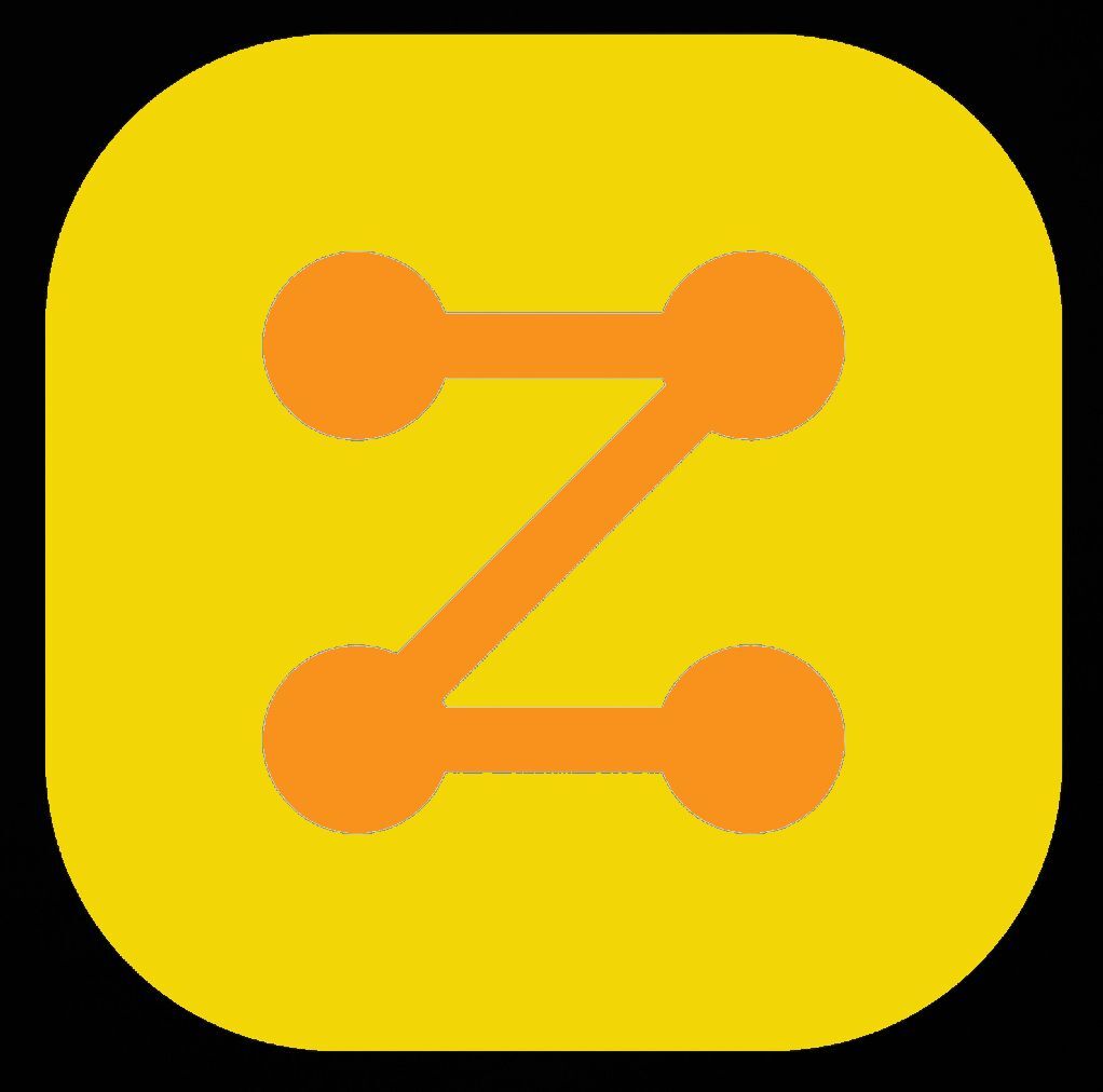
I'm going to start promoting this because people keep asking for something that:

- is simple & recognisable

- literally anyone can draw in 3 seconds

- is NOT a Lightning Bolt

- shows that we're talking about a network

- fits nicely next to our competition's icons (Mastercard, Visa, Amex, Discover, Apple Pay...)

- Pairs up well with the Bitcoin "B"

This logo has been doing the job for me for a few minutes and I still like it.

Reply to this note

Please Login to reply.

Discussion

This is genius! Here's the compromise in the #LogoWars

We keep the ostrich as the #Nostr logo, and make the N logo sideways and use it as the #zap logo

nostr:nevent1qqstvhcjrgwrrnld8xspgvgt4l64t3qm494zpydp8rw9y2v8g3tcgzcprdmhxue69uhhyetvv9ujummjv9hxwetsd9kxctnyv4mz7q3qyx6pjypd4r7qh2gysjhvjd9l2km6hnm4amdnjyjw3467fy05rf0qxpqqqqqqzyzcvy5

✅ APPROVED

Sorry, but this is what I still see, but now they’re laying down. I don’t like this logo at all.

IS THAT A LOGO PROPOSAL?

✅ APPROVED

😂 🤔🤷‍♂️

If it must be a z, then a z like Zorro!

I like the lightning bolt.

This is the way

can we make those dots into covid cells 😂

Anything is a penis if you're trying hard enough.

Well done!

Anything? 🤔

I love minimalism, a collection of this style of icons might be great

I really like the N logo, emphasizing the relays, this Z for zaps works well. I would like to see the N with "OSTR" each individual letter in each bubble of the N

Sorry I couldn't understand what's wrong with the lightning bolt icon

I like it, can you add an ostrich to make it pop?

Do you have an example of how this sits next to the competition’s logos?