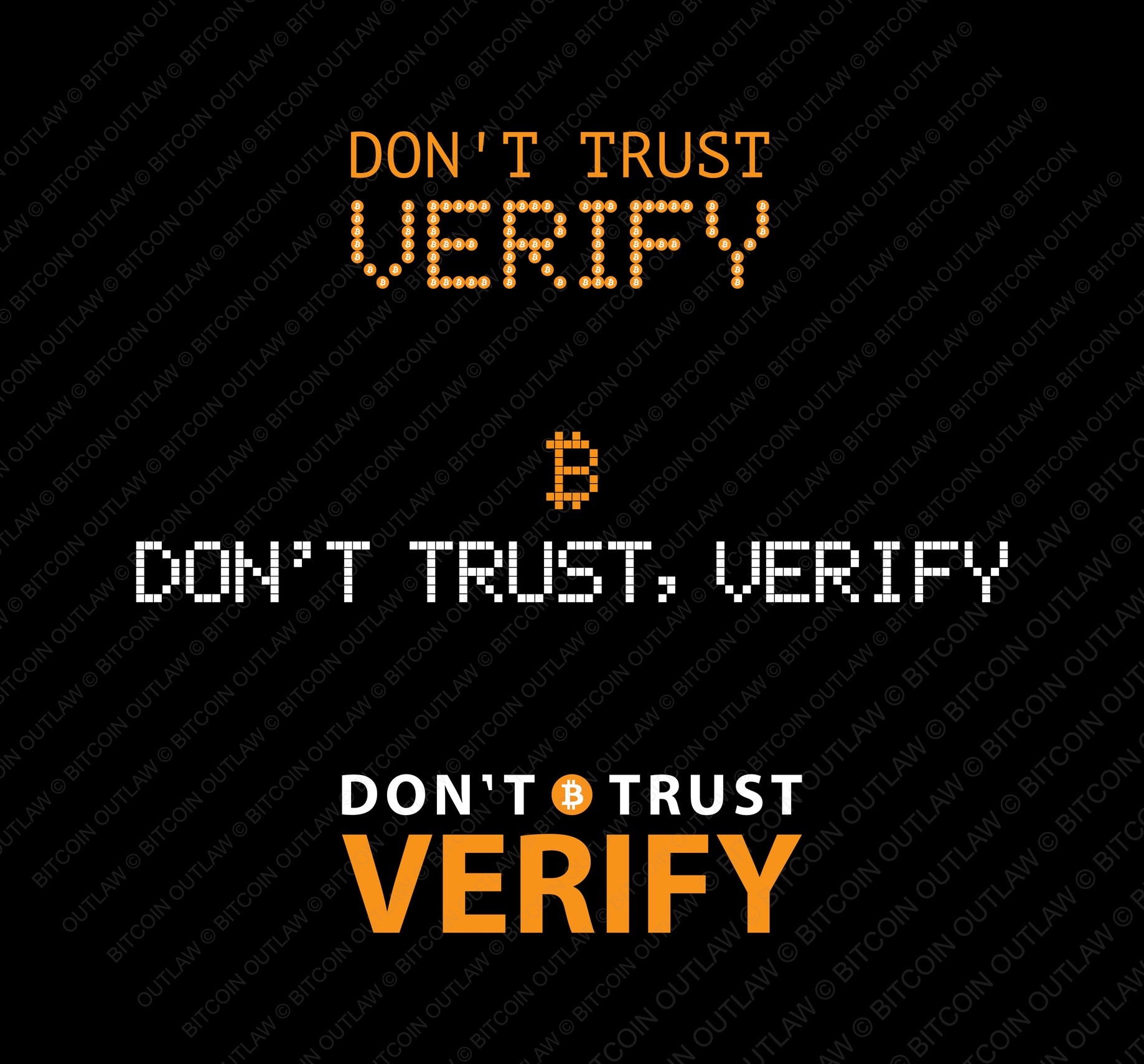
Definitely the Top. The “verify” doesn’t immediately look like it’s made of the BTC logo, but I’m also looking at a small image. I like the marquee look of that style, and the priority implied by the layout and font sizes.
Middle kinda blurs together for me.
Bottom - I stop at the BTC as if it were a period at the end of a sentence. So the rest reads as “Trust Verify” which is confusing. This could work better if the BTC logo was at the end of the top line, making it a useful sentence end period. If that’s done, it might be my preferred option.
All of the above just my opinion. 🫂


