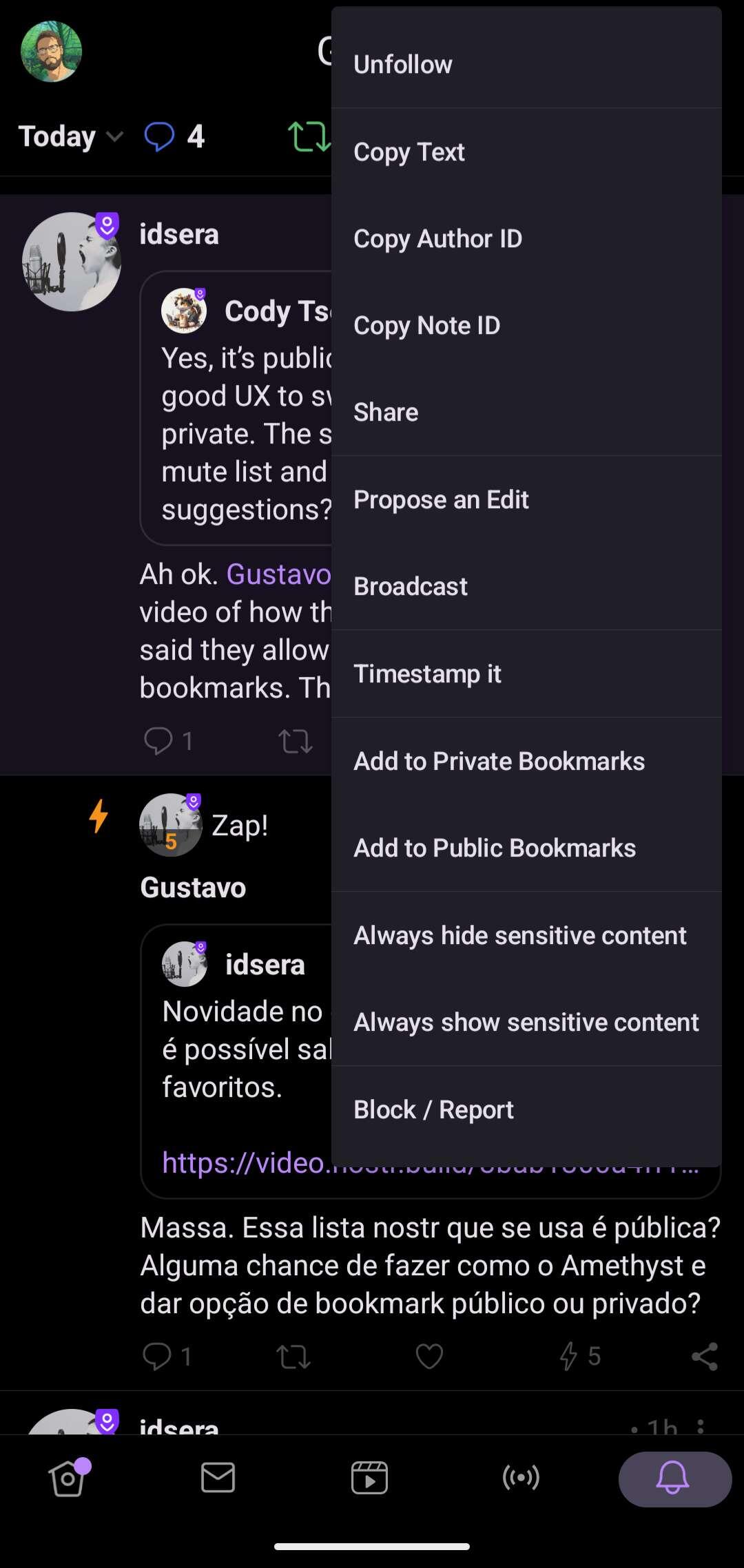
It's definitely not the best thing in the world, usability-wise, in amethyst. One has to click on the general note options (3 dots), where this gigantic list drops down from, and from there there are the two possible bookmark options. Maybe two bookmark ribbon icons, one with a mask overlay? Ill let the UX overlords speak.