Ah ok. nostr:npub1c09t5gp382u2g37e4tjs73002pdgg4x9wj8kpcxwqy65r7qwyreq42tecr could you please record a video of how the Amethyst UI works? as you said they allow to have public or private bookmarks. Thanks.
Discussion
The UX could be very simple. When clicking on bookmark button, show two options like the repost button. So show the options Public or Private.

Look good to me. We also need a simple way to distinguish between public and private.
Distinguish where? The icon can be the same, and on Bookmarks page could have topbar tabs for Private and Public.
I might want to use a different icon, or maybe add a lock icon.
Not necessary. Doesn't make sense. Bookmark is a bookmark, doesn't matter if is private or public. And doesn't make sense have the same note being bookmarked public and private at the same time for example.
If someone wants to know if it was bookmarked is public or private, just click on the icon and will show if is Private or Public, with option to uncheck or switch between public and private.

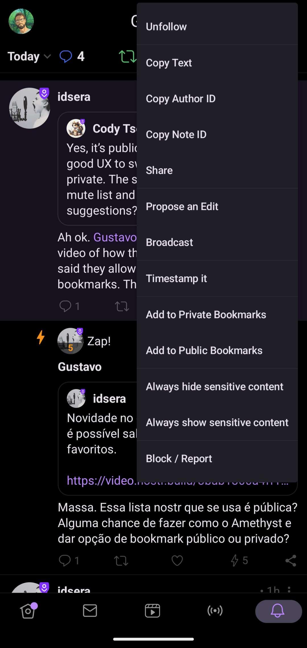
It's definitely not the best thing in the world, usability-wise, in amethyst. One has to click on the general note options (3 dots), where this gigantic list drops down from, and from there there are the two possible bookmark options. Maybe two bookmark ribbon icons, one with a mask overlay? Ill let the UX overlords speak.