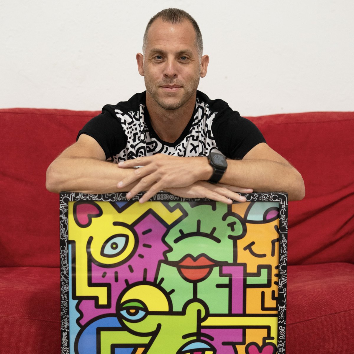
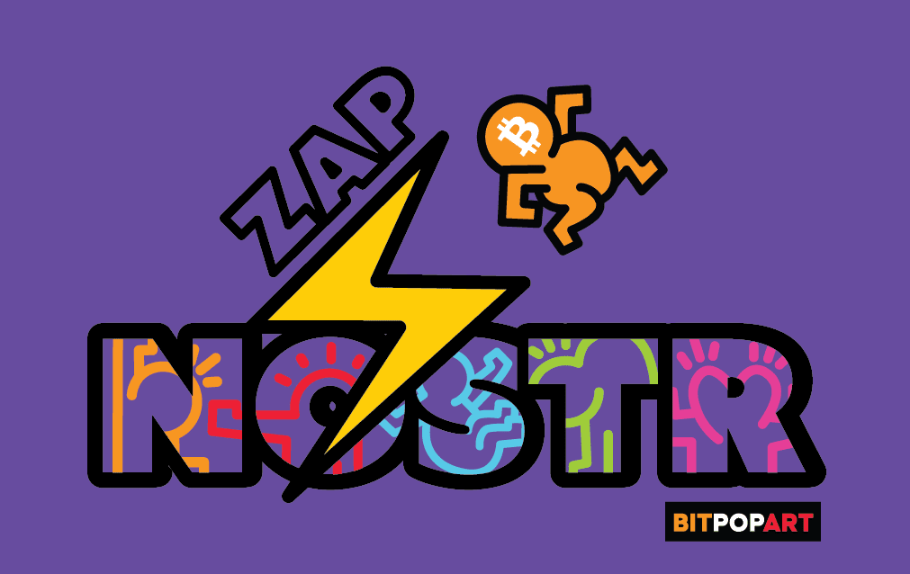
Just playing around. Tell me what is your favorite !? Satscard nostr:npub1az9xj85cmxv8e9j9y80lvqp97crsqdu2fpu3srwthd99qfu9qsgstam8y8 🤙 #grownostr #nostr #artstr 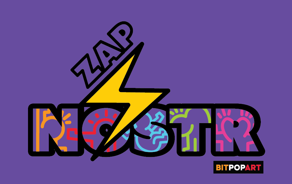
Discussion

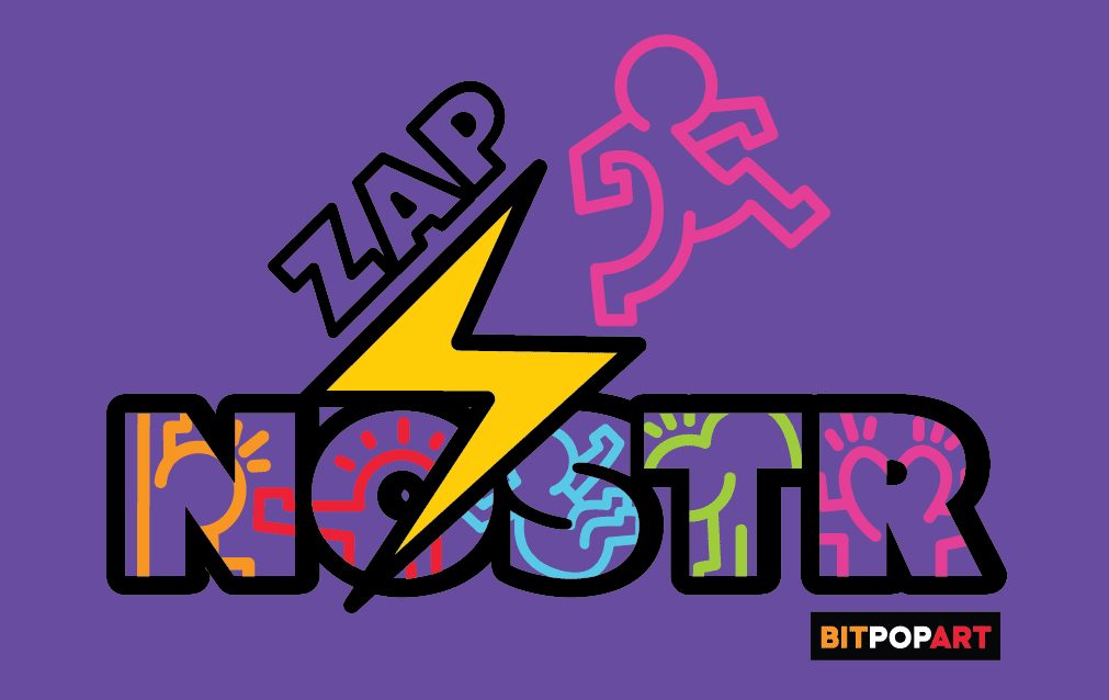
The last one!

W the pink person because they look like they are growing/being “lifted” thanks to the zaps

1st one, the rest are getting too busy. consider legibility. just my 2 zaps worth.
#smij #zapd
nostr:npub1gwa27rpgum8mr9d30msg8cv7kwj2lhav2nvmdwh3wqnsa5vnudxqlta2sz , can you try centering the Zap ⚡️ just on the first one?
Like this 🤙#zap #nostr 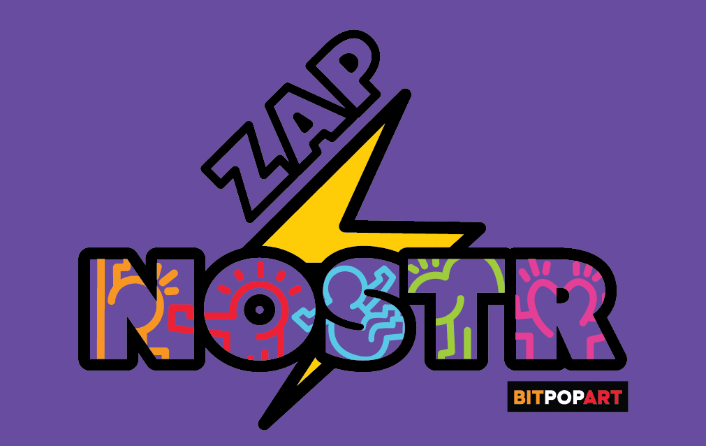
かっこいい😎

Would it be too busy if you added the same yellow color to fill in the word “ZAP”? Or maybe keep the fill purple but the outline yellow?
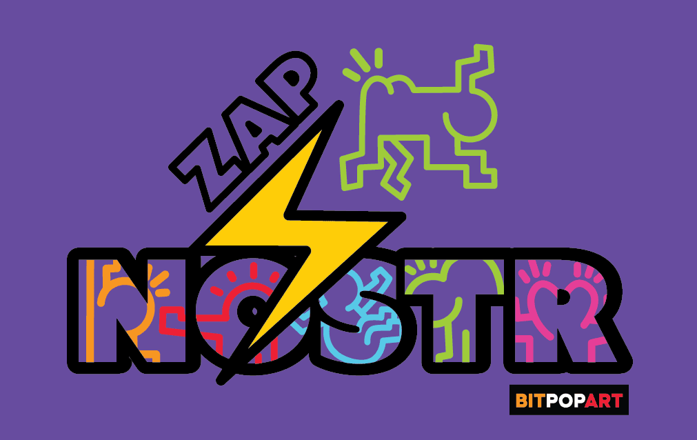
It hides in the background a little too much IMO.


loving it 🤩🤩


1

The first one. Simplicity works great.

4th