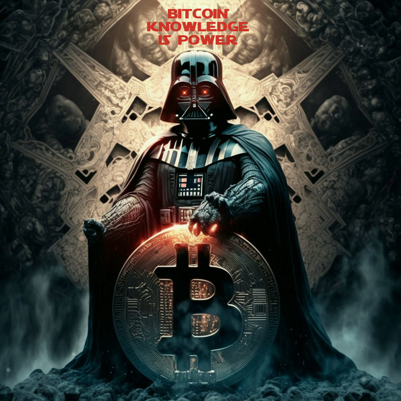
right... now I see it. The logo is not so bright
Discussion
I think they just took the logo off the website and shrunk it down. The logo looks OK when it's full-size, but it's basically black and gray, so it looks really dark when it's shrunk. They should replace the gray with white, then shrink it. It'll stand out more that way.
