Concept (next to the original, but vectorized logo by #[0] )

Concept (next to the original, but vectorized logo by #[0] )
I think I like the bottom better (original)
i like it better too - but got used to Nostr without logo lol. Change is hard mister!
Top one is cool. Bottom is classic.
Classic 🤙🏻

Also, side note for symbolism.
Nostrich running…. “Running Bitcoin”
Classic ode in symbolism
On white I can see it, on black the head shape vanishes
Meaning, top 2 lines. It’s actually 4
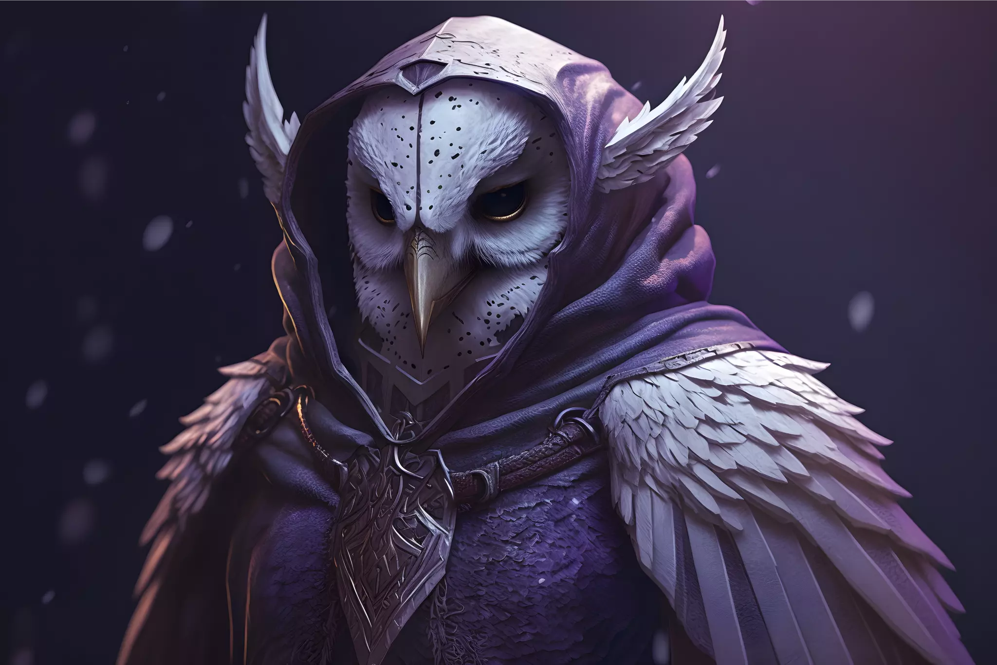
I like them both! I find the feathers fringing the head are a bit light on your new design, I had to zoom to see the detail. If they stood out a bit more it might look even better. 💜✌️
Noted
I would like the top one better than I currently do if it didn't seem to have a strap across it's face. Without that it would be a tough call.
Looking great as always Karnage! Keep up the amazing work 🤙
These are great! I prefer the ones on the bottom. I’ve been looking for something like this to add to website footers, for example. Perhaps submit to https://github.com/simple-icons/simple-icons ?
💜⚡️