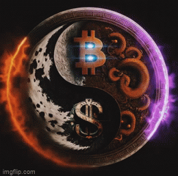
Getting stickers made for local merchants... which is better?


Getting stickers made for local merchants... which is better?
----> *
does the word "chiavenna" have anything to do with locks? the portuguese word for key is "chave"
Yup. Comes from "Claven", old latin/romanch for key. It was a historically very important pass through the alps.
Numero 2 😁🤙
Both are nice but #1 shows the recognizable logo for all us #bitcoin freaks.
Yeah, I agree. I like the orange better personally but the recognizability is going to be way higher with the standard logo...
2
I like the second one but the first one probably «pops» a bit better in the shop?
The orange one is super cool but honestly the contrast of the white one grabs attention more readily, and it has that ubiquitous logo 😊
For me, the first one.
Sono belli entrambi, ma vedrei meglio il primo esposto in un negozio
#1
the white with the BTC symbol is most recognizable....but I do like the orange one too !! ✌🏼☯️
White one
White one
#2 is awesome
I like them both!! If like the top one more if the key were alil bigger.
2nd by a long way