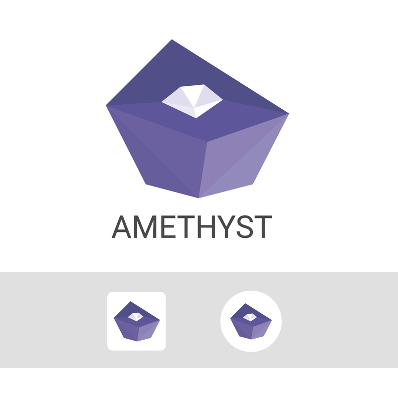
As they stand today, with Color to Alpha, I think the Zelda-shaped one is looking better (ignoring darker droplet). Take a look:
Discussion
I the app was mine I would choose the Lula/my version, but you have to follow your taste 👍🙂
However in the first version I suggest more padding around the rock, like in my example.
And I would not put the logo on the top of the app, no need to recognize it while I'm using it.

