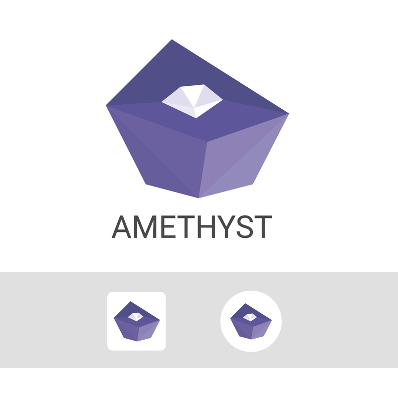
Perhaps I would split also the top surface darkening the upper part.
It is quite clear both as a logo and as an icon
#[3] #[2] 👆?

Perhaps I would split also the top surface darkening the upper part.
It is quite clear both as a logo and as an icon
#[3] #[2] 👆?

As they stand today, with Color to Alpha, I think the Zelda-shaped one is looking better (ignoring darker droplet). Take a look: