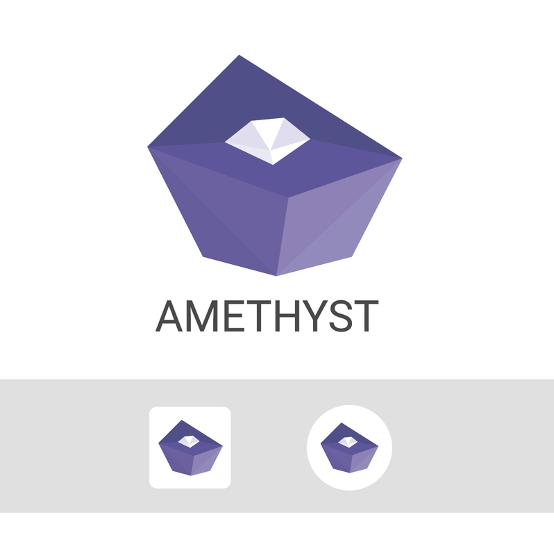
No, I prefer your version :) But perhaps with my color, low poly effect and the central white insert.

@note1tan2h9w6xstv404qckxql8pd46mhy3370w09st5cyyu0k2tsmlws6js0ez

My first torus "round" proposal is ok for a logo but need more work for the icon version.
Reply to this note

Please Login to reply.

Discussion

Perhaps I would split also the top surface darkening the upper part.

It is quite clear both as a logo and as an icon

#[3] #[2] 👆?

As they stand today, with Color to Alpha, I think the Zelda-shaped one is looking better (ignoring darker droplet). Take a look:

https://photos.app.goo.gl/Ldr73qsgRXfae4ET8