So, I liked either the reversed dual color, #[2] (4th), or #[1] 3D version.

I am inclined to keep purple as the main color but could be convinced otherwise.

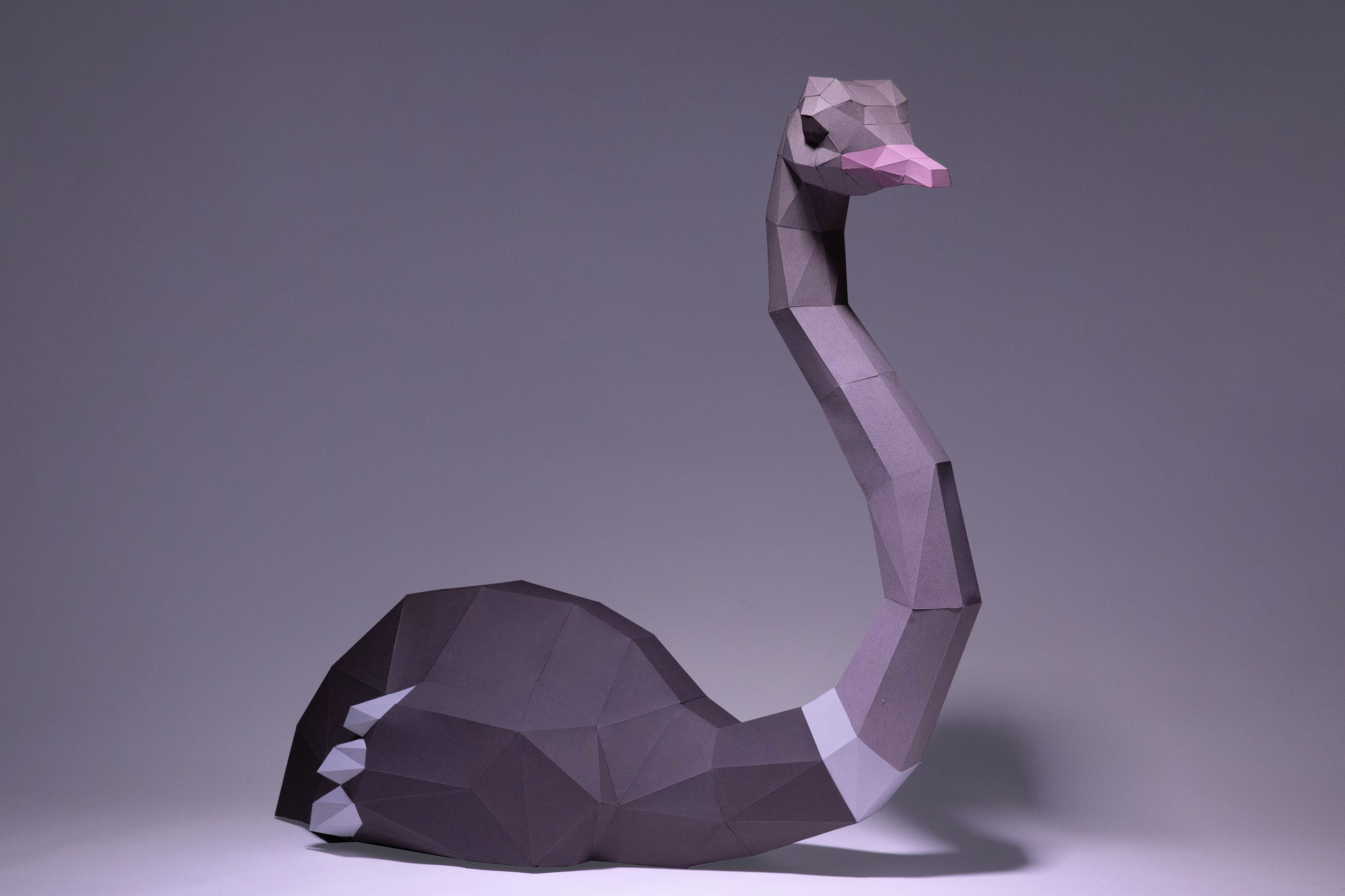
Also, no need to resemble the gem. We could do a low poly ostrich with hard corners in purple to represent the gem. Kinda like this:

Reply to this note

Please Login to reply.

Discussion

Not sure which my logo versions your're refering to as the "4th". Is it the bottom right version on dark background?

(can you point that out on my image please).

I like purple will work on a purple version.

With regard to the ostrich I think it might be hard to achive a simplify version that could be used as a logo/icon, I'm trying to visualize how it would work in small sizes like the 96x96px app icon

Purple - I like it better than my initial blue color scheme