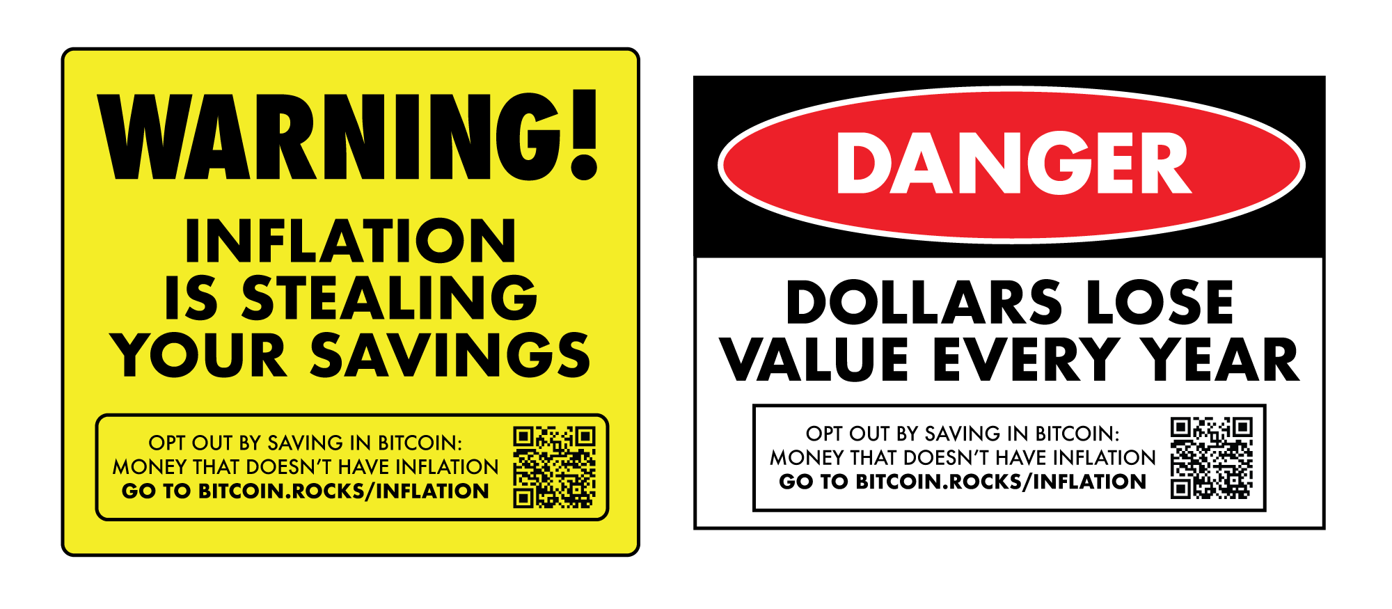
Working on some new #bitcoin sticker designs...
What do you think?
Love it? Hate it? Change it?
Please let me know!
Working on some new #bitcoin sticker designs...
What do you think?
Love it? Hate it? Change it?
Please let me know!
Looks Sick!
I like the one on the left better.
Love these! Very nice!
DON’T STICK YOUR FINGERS WHERE YOU WOULDN’T PUT YOUR DICK NOW THAT’S GOOD ADVICE
They are perfect! ⚡
🧡
Danger Due To (Inflation) is a common format in construction.
I like danger.
💯🔥
😎👌
I like the one on the right that's red black and white. It's something that is eye-catching and people will most definitely do a double take.
#BTC #Zap⚡#Nostr #FreeJulianAssange
I like them both, but the melting ice cream in an earlier reply made me think: the image of a dollar bill (or a twenty) melting or disintegrating would be probably be particularly effective.
Overall great!
If I had to critique: Perhaps add a circle around "WARNING!" on the yellow one. I'd even consider adding a "☹️" too, just to emphasize the emotion.
Add an exclamation to "DANGER!" This emoji can be added at the end of "Dollars lose value every year" 🤯!
These adjustments could catch more attention.
Plus, I agree with nostr:npub1yshqv640r9q0kudgamhzvtqwwwv97tqhc6t66purmwslgtrg6gcs3qh359 syntax adjustment.
Love it
Love it! 🧡
Love it. The sad thing is that most normies would probably ignore them or not read them closely enough to realize they're not the typical warning/caution/danger signs.
These are bangers!
They catch the eye a lot, grest idea guys!
Do one with the "Danger high voltage ⚡" and put a source for understanding bitcoin lightning network.. 🤙