
Haha, gonna look into that tho. We can copy the good stuff from them too 😉
It works now, found the problems. Don't know what it was and sorry to have bothered you with that.
Why is that? I'm blinded by how much I dislike the aesthetics 😉

Man, I love having you in my feed! Great input again.
I started from mobile with very similar sketches to yours but from a different assumption:
That you only really need to see the two previous levels (and not the very Top level) and then scroll up from there.
I see users mostly following a pattern of 6 steps down, 2 steps up. Similar to how they browse deeply nested documents.
On mobile I thought of something like this:
https://cdn.satellite.earth/dac0ffb69394b9dc528e2439c7557ad57d75c430bbe325e67629134b5f3952ef.mov
On top it shows the parent and you can horizontally scroll through the path or click the show/expand path button.
GM from the farm ☀️

I'm gonna be thinking about that comment about giving priority to conversational-chat UI's for days 🤯
Me: Listens at 2x speed and thinks you sound completely normal 🙃
YES!!!
Two of the people I admire the most, riffing together.
Just made my day
nostr:npub1jlrs53pkdfjnts29kveljul2sm0actt6n8dxrrzqcersttvcuv3qdjynqn nostr:npub1gcxzte5zlkncx26j68ez60fzkvtkm9e0vrwdcvsjakxf9mu9qewqlfnj5z
Mine too! TGFN is a such a freaking great podcast 🔥 every episode is insightful, this one especially.
I'll upload and send some versions when I'm back on desktop.
I did all that, typed full problems, clicked log and I can't find 'em nowhere 🤔
My first problem with the nostrocket problem tracker is that I can't seem to log problems 😂 . So I'll do it here for now.
Problem: This will probably become an infintely nested tree of problems. So indentation is not gonna work past 20 or so levels (on desktop, let alone mobile).
Possible solution: 
Combining Miller columns with an Email inbox-like layout could be something. You can still see the parents and easily scroll back or expand a certain level again and you have a clear overview of all the problems on the same level.
Also, on the opened level I'd avoid an extra click on a problem and already show the necessary info and buttons (log subproblem, status, tag, claimed by...)
Lastly, a sidebar menu seems better to me for this kind of app. Keeps nested notifications/categories in sight.
nostr:npub1mygerccwqpzyh9pvp6pv44rskv40zutkfs38t0hqhkvnwlhagp6s3psn5p nostr:npub1arkn0xxxll4llgy9qxkrncn3vc4l69s0dz8ef3zadykcwe7ax3dqrrh43w What do you think? #nostrdesign
Logo for the first nostrocket app? nostr:npub1mygerccwqpzyh9pvp6pv44rskv40zutkfs38t0hqhkvnwlhagp6s3psn5p 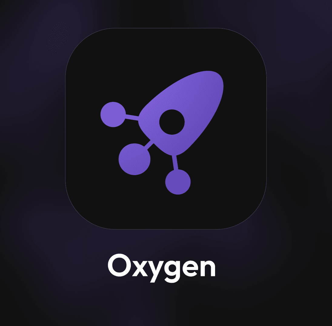
It references relays, atoms and rockets 🚀 #logodesign
Good point, but given that quite some apps use the upwards arrow for reposting it should not be crazy confusing to find. And once found....
I always saw it that way ♻️ . Not in a bad way tho: Curation is a skill, so is reposting.
Very Interesting. You can probably also add a Highlight button. The app then allows the person to select part of the note and creates a Highlighter event, like nostr:npub1l2vyh47mk2p0qlsku7hg0vn29faehy9hy34ygaclpn66ukqp3afqutajft does.
Also, that Repost icon we all use doesn't make any sense to me. Two arrows going back at each other is not a good representation of "Share in my Feed".
Good idea. Highlighting is definitely in that same category, makes sense 👌
This is how I'd puzzle all the share options together. All under one button, withe every icon having its most common use. #nostrdesign https://cdn.satellite.earth/95f206c69cee9bf069ffa08763ad37056ceeed8a6d72c8b6dbc8661b351a25d3.mov
A new episode of the Freedom Footprint Show is out 🎙️👣 and today our guest is nostr:npub1klkk3vrzme455yh9rl2jshq7rc8dpegj3ndf82c3ks2sk40dxt7qulx3vt 🔥CEO of ZKSnacks, the company sponsoring the development of Wasabi Wallet.
Our chat was incredible, you don't want to miss it!
Watch on YouTube:
Listen on Fountain:
https://www.fountain.fm/episode/Sgpg0L8hnXaT5yTQVoBb
nostr:npub1jt97tpsul3fp8hvf7zn0vzzysmu9umcrel4hpgflg4vnsytyxwuqt8la9y nostr:npub1fk8h6g8zhftw8c7pga2zjd84p2z949up5lc3qdchm9v4m0q7mwws7jcwld
#bitcoin
#podcast
This was great!
Wishlist for primal.net (cc nostr:npub16c0nh3dnadzqpm76uctf5hqhe2lny344zsmpm6feee9p5rdxaa9q586nvr).
1. Store profile metadata in local storage; browser should read from that instantly on refresh then issue a fetch in the background to test for updates. A refresh shouldn't do a full refetch every time: it takes forever and slows the whole experience down.
2. Messages that were marked resurface as unread. It's annoying and makes me want to write a firefox plugin to hide the message button entirely.
3. In Settings>Appearance, allow a minimal mode where the primary nav can be reduced to only icons (no text) and font-size for the entire site can be made larger.
If you zoom in, you can have (3). It already does that on smaller screens.
An extra plus is having the notification dots way smaller and less in your face 👌
Yeeeees! That's awesome 😃.
Somehow I keep making logos that could be great for something completely different than what I'm actually desperately trying to find a design for. 🙃


nostr:npub1zach44xjpc4yyhx6pgse2cj2pf98838kja03dv2e8ly8lfr094vqvm5dy5 nostr:npub1r0rs5q2gk0e3dk3nlc7gnu378ec6cnlenqp8a3cjhyzu6f8k5sgs4sq9ac if ever these could be useful, let me know!