
#wordle 1,387 3/6*
⬛🟨🟨⬛⬛
⬛🟨🟩🟩⬛
🟩🟩🟩🟩🟩
clean
iOS Notes just works.
Very tough, you pretty much aced it with 4 tries
More space for my Wordle posts to shine then

Oh come on, you have a party, freshly grilled food, and now also a cute dog with a cool name. Show off.
Seriously, very likable looking dog, with handsome fur.
Yes, another Aidan short proposal, big fan so far.
Time to NIP domain bureaucracy in the bud, heh . Yeah, yeah, I see myself out. Only to think over those proposals though. nostr:npub1reezn2ctrrg736uqj7mva9lsuwv0kr5asj4vvkwxnrwlhvxf98tsq99ty4 mentioned giving bits a try in BDK Wallet. I found some new, elegant options with transitions, no new unit though.
One of the many.
I naively get the sense that Nostr will casually overhaul the entire internet, and we will eventually trade browsers for Nostr clients. Let me stress naive, still though, I like nothing much that comes out of a browser these days, and I have no desire to grovel before ICANN for a domain name.
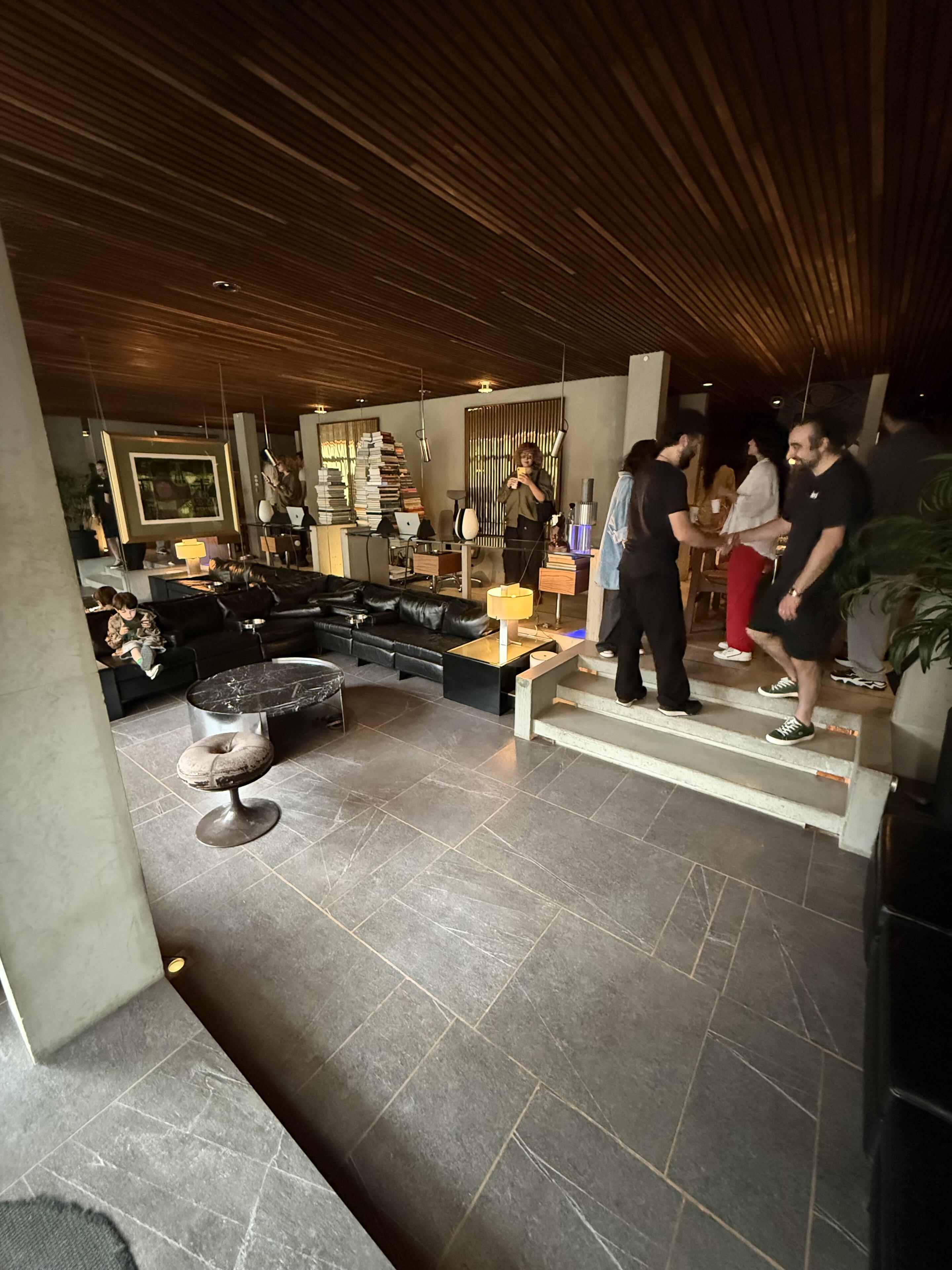
This looks like a sleek midcentury modern pad, nice. Also, never heard of her either, must make no good company haha
I like the counter concept, regardless I can see the visual disruption.
If doable with reasonable effort, I suggest a settings option.
I would also prefer counters only as main icon color shade icon badges, no additional floating numbers.
I prefer minimal customization options, I trade the counter option for theming though.
Least I would consider reducing the theme number to few subject related options:
- Nostr Purple
- BTC Orange
- Nostur signature color
I would move the Turtle to the user settings pane, that way it also gets an immediate text explanation.
I then try moving the quick settings over to the left corner, making it a really innocuous, small icon, hollow dots or dot, ellipsis, tickbox list.
I might give the headline more space, make the fond bolder, possibly larger, make the touch targets look more tappable. In line with the Radio, which I might just integrate, indented from the left, with the categories menu.
I might scale up the already reasonably large bottom icons and float them alone above feed with no backdrop, or semitransparent backdrop.
I would consider making the top Nostur icon a monochrome solid in the same tone as the bottom icons.
I would possibly circle all of them or none.
Then I would probably throw it all out anyway once the rumored iOS 19 redesign comes out.
I would also look to integrate the iPad automatic adaptive top bar menus in a meaningful way, possibly for the bottom icon categories, like the App Store app.
The new color layout looks neat!
Now, if it matters, I would also see potential in adjust icon scaling.
Something seems instinctively disproportional.
They should possibly either get a common hard vertical boundary, or, in case of the turtle and gear wider spacing, and therefore smaller scale overall.
Did they release new music too?
I had a tough time getting into Daisy back then, even when it looked cool conceptually.
Oh, great, another wordle kindly flipping me off haha


Right on! And finally seeing real acoustic sound made by real physical exercise again for a change, so compelling.
Ride comfort depends on the entire assembly, tires, wheels, chassis, seats, leg space, interface and automations.
I mainly wanted to highlight visible nonsense in legacy manufacturer cars. Why should I care about further details, when they so clearly disrespect their users?
Teslas have their trade offs and possible flaws, at least they look and work like an honest, original effort.
You rank Tesla last among these three?
My local regulations block access to FSD, and I talk as an above 195cm 6'5" guy.
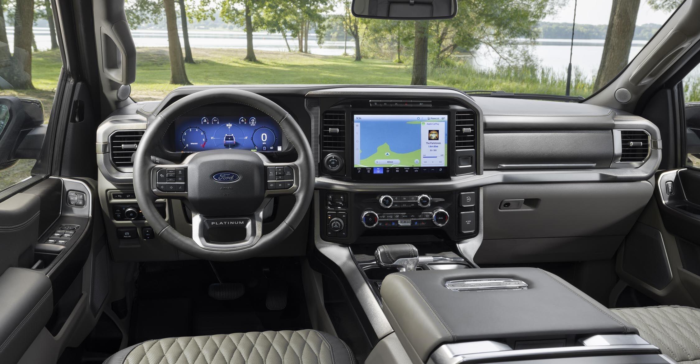
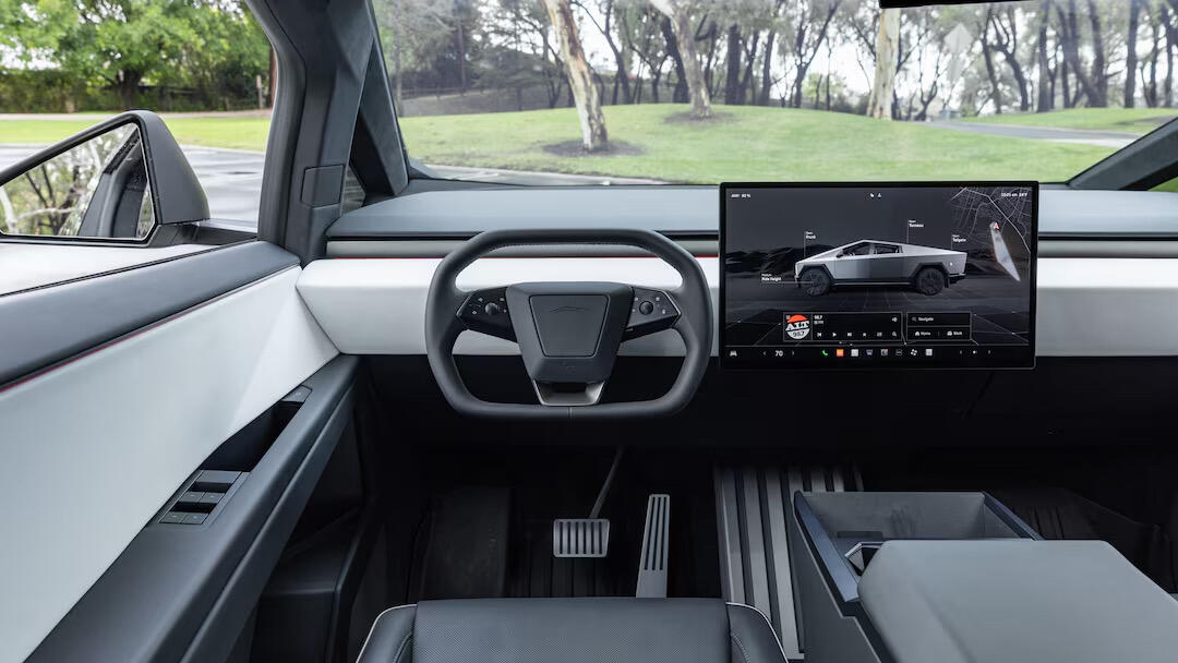
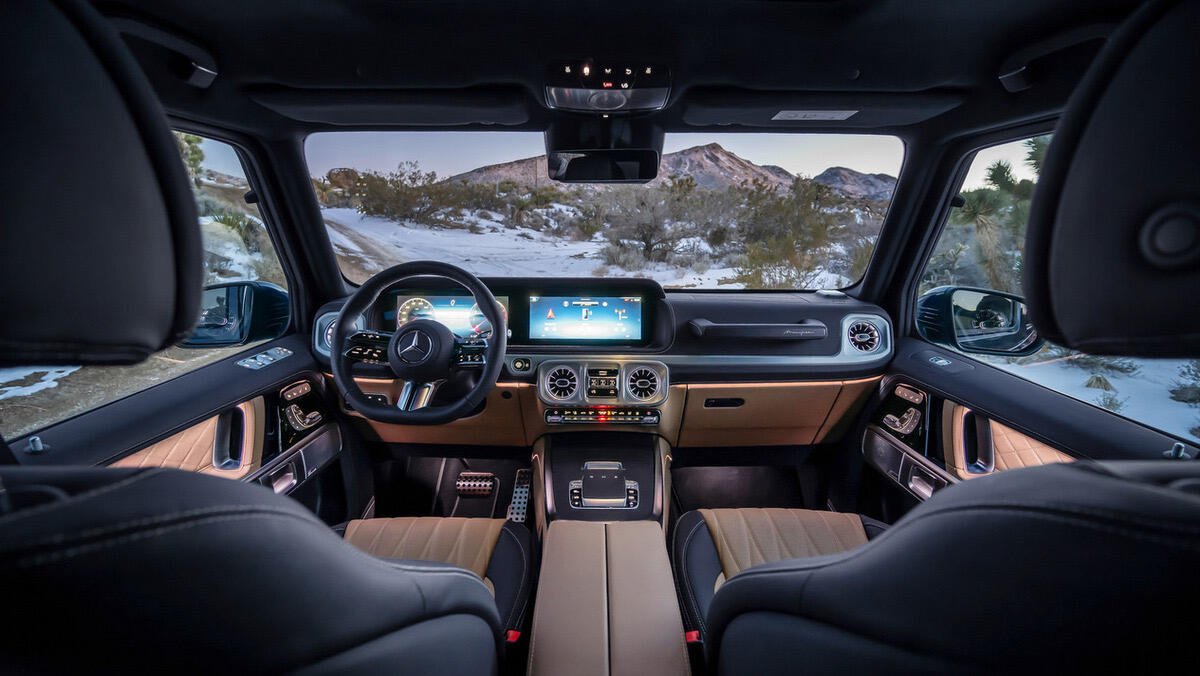
Which one?
Care to post a picture of its interior?
This one feels smooth.
Any chance we get a contiguous background color, either as an optional theme or general adjustment?
At least on OLED screens the dark background shade difference between feed and menus feels almost like an error.
Tesla make the only nice cars among those I saw or drove. The interiors alone look inanely heterogenous and busy in other brands.
Me too, I enjoy landing on impractical words that sometimes garner the most useful results. The game, in all its mundanity, allows for little sparks of depth, if you use them.