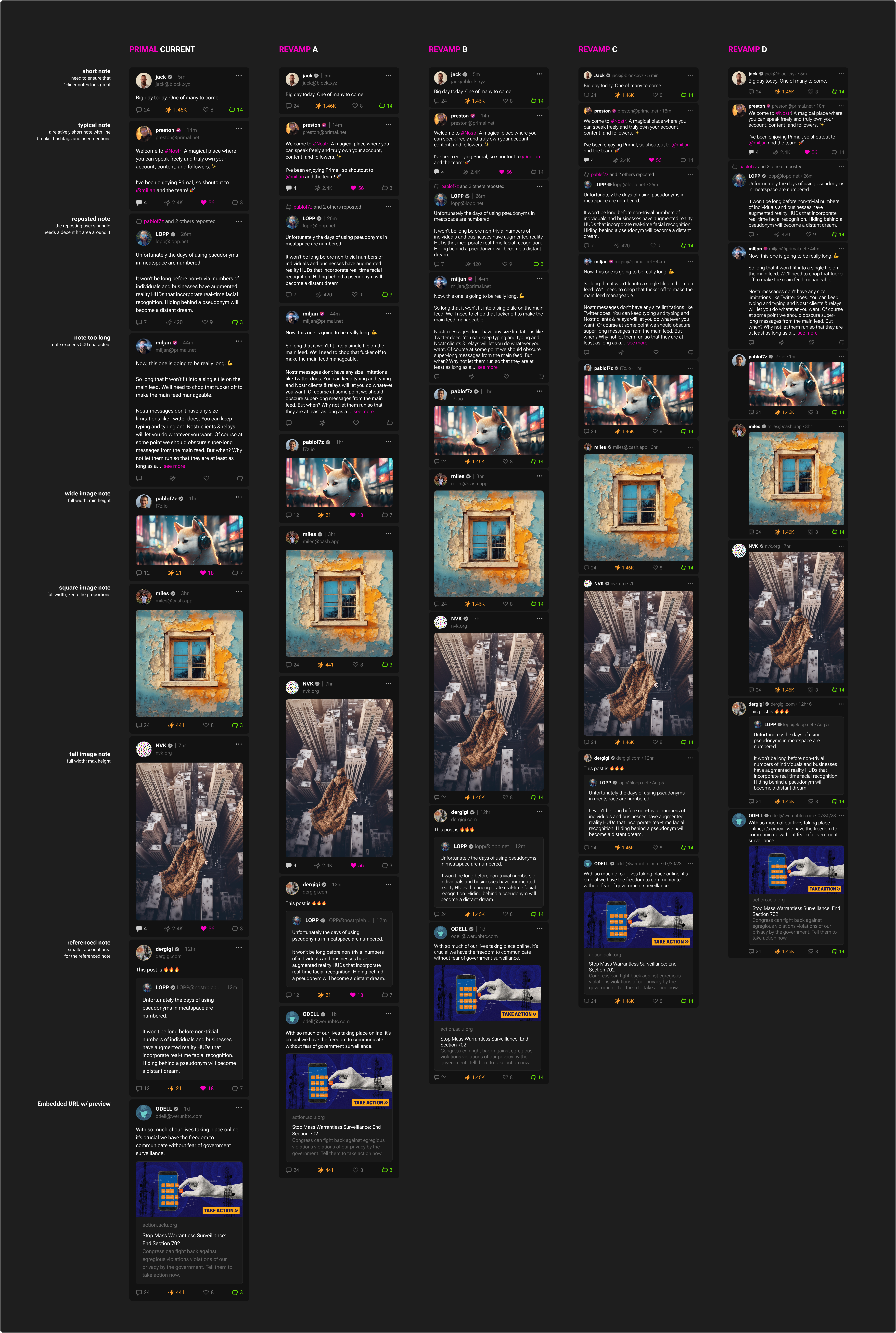
Indeed in the "current" version the line height is too tall.

I would offer a preference:

* Standard (A), but increasing the font-size ~20%

* Compact (C)

This way you also please those who want a slightly larger font.

The D is a good alternative to C but the space really saved is strongly related to the presence of images, and the left empty space is not so useful.
Reply to this note

Please Login to reply.

Discussion

That's an interesting suggestion; thank you!

Font size will definitely be an option regardless of which layout we end up picking. Having "standard" and "compact" layout options to pick from is something to consider.

Yes, the font option is critical for usability and accessibility. Since it is sometimes not so easy to manage it dynamically, mixing it with a couple of static density options is a good move to provide effective options without crowding preferences and complicating development.

Otherwise, the classic approach is to have 3 fonts, 3 spacing options and let the user combine them.