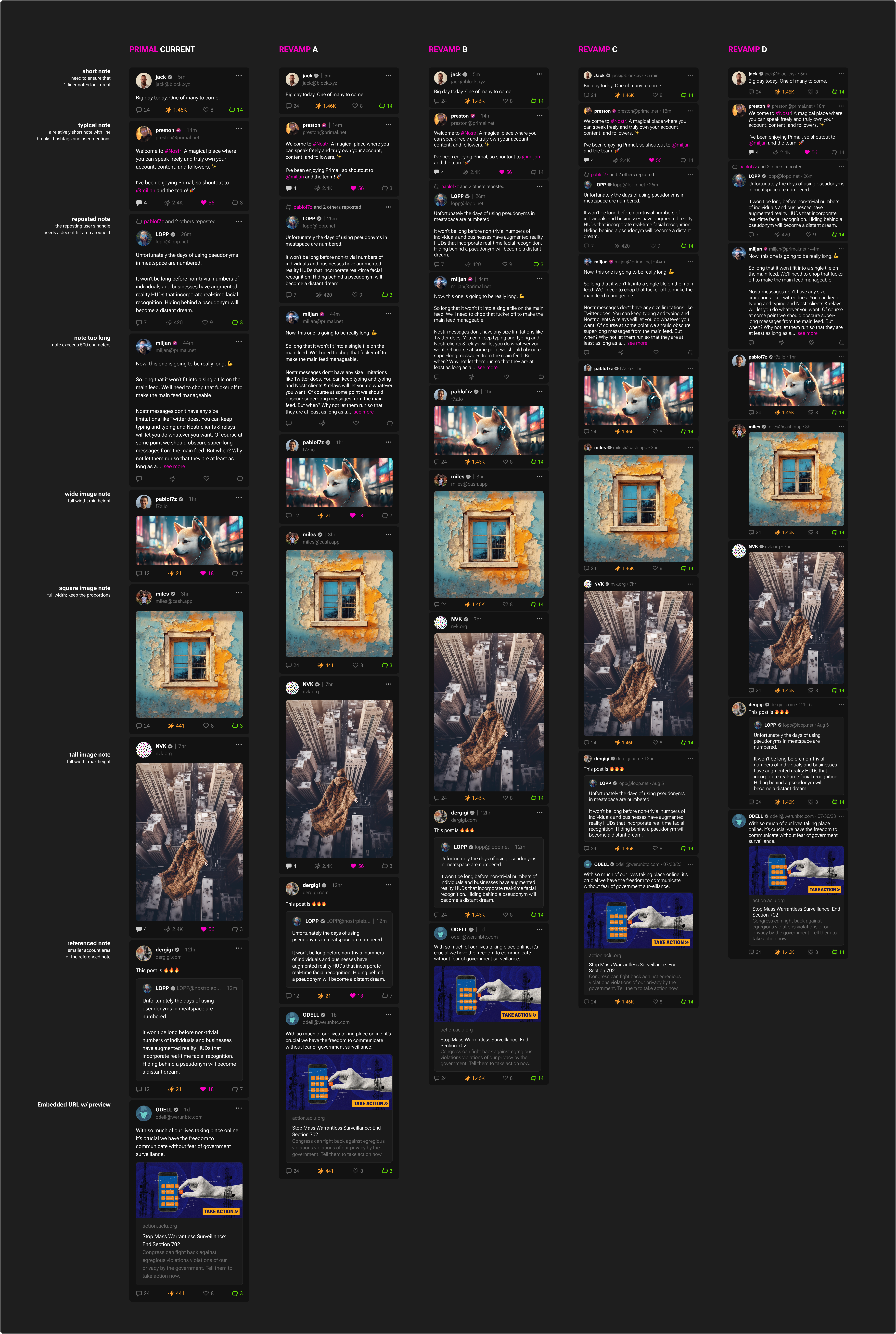
We are redesigning the Primal phone feed. One of our goals is to optimize for information density. The current design is probably too sparse. Here are some concepts we are throwing around. Thoughts?

We are redesigning the Primal phone feed. One of our goals is to optimize for information density. The current design is probably too sparse. Here are some concepts we are throwing around. Thoughts?

I like D
D
I like the baby icons in C
It is hard to judge through the pic. Anyway, I like Plebstr-style UI more than Damus-style. But I'm almost using Damus only due to optimized UX and Zap. Zap takes greater than 80% portion of reasons of my decision.
One more thing: I think it would be nice if I scroll down to refresh, it would show the old notes which I've been missing, not only latest ones.
I like C , it's kind in between layout readibility and 9 posts per page ... :)
I like revamp D the best. Seems like it makes the best use of the space.
My personal choice is revamp C nostr:npub16c0nh3dnadzqpm76uctf5hqhe2lny344zsmpm6feee9p5rdxaa9q586nvr
i'm so bullshit on this
i like compact, but the empty space on D's left is not good ....
Go nuts: D.
I am confused nostr:npub16c0nh3dnadzqpm76uctf5hqhe2lny344zsmpm6feee9p5rdxaa9q586nvr
🤣🤣🤣🤣🤣🤣🤣
C or D
C or D
Just imagine not claiming 7 Sats every hour and Spinning a wheel once a day to win even more Satoshis!
How dare you!
➲ Join Freebitcoin to claim your free Satoshis!
➲ How can you sleep on that? Its free Satoshis!
☛ Go to https://freebitco.in/?r=51948555 and register your account to start claiming free bitcoin!
#earnbitcoin #freebitcoin #bitcoinfaucet
Combine C and D. So C, but increase profile image size until half of the circle extends off the left edge of text and creates a bar of white space 50% width of D’s
Revamp B for everything except the font-size and line-height. I love the readability of the current font-size and line-height.
Don't like the container for D or the tiny avatars in C.
Sparse is better imo
Indeed in the "current" version the line height is too tall.
I would offer a preference:
* Standard (A), but increasing the font-size ~20%
* Compact (C)
This way you also please those who want a slightly larger font.
The D is a good alternative to C but the space really saved is strongly related to the presence of images, and the left empty space is not so useful.
It seems intuitive that the far right version is the best, but what am I missing nostr:npub1sg6plzptd64u62a878hep2kev88swjh3tw00gjsfl8f237lmu63q0uf63m ?
# Revamp D it's the best of all
Order of preference:
1. D
2. B
3 A
Not C
Add me as another vote for D!
C is also good.
Larger profile photo versions are definitely better IMO
Revamp D … for the profile pic extra column alone.
C
more parts per millionth
Not a fan of D, too much empty real estate on the left. I’d prefer C.
Cool man I was just testing it yesterday and thought it could have more density. It looks slick, but I have a big phone screen and I'd like to see more than 2 notes on it at a time as I'm scrolling.
Loving Primal so far. Primal web is my daily driver now. When Primal Android has zaps working it'll be my main mobile Nostr app.
Any but D. Look at all that wasted space under each profile pic 💀
D
don’t the profile images look way too big on that option? 🤔
L
I vote D
C because of the profile pics being smaller (they contain less info and can be recognized at a glance). Content itself still has the full width 👌.
Lineheight is a bit off though and the margins/passings are not consistent yet.
Won’t load no matter the platform or hardware
C
D 
D
D
I like D because of the clear section separation thanks to avatars. C is ok height wise
B or A. Have all of those, but let users pick between them in settings.
C
Let me pick between A, C and D but adjust the font size to my liking.
This is coming from a visually impaired guy constantly using screen magnification: The ability to adjust font sizes is an insane help as we can now match how far we scroll our magnifier versus how much information we can guess from a glance without.
On Element on my Android phone, I have a much bigger font size, so I can skim messages for words by their optic. If I am interested, I can zoom in with the screen magnifier and read. Since the font is bigger, I don't have to zoom in far to read it well, but still have enough density that I have to move the view a little.
I wouldn't neccessarily call this an "accessibility killer feature", but definitively something I would absolutely want.
Thanks for reading!
Make sure to test with 5+ reposts of the Nostr Report, and a handful of other notes in between them. ;)
Last one feels best.
Side note, when zooming in this image in primal, you can’t really zoom in it’s a pain viewing it on mobile
Looks good! 👍
C
C
A
D
D
C/D
But why no slider? It's also screen resolution and device font size dependent.
Cool !!
Proportions and spacing on Revamp C are just right 👌
Liking the compactness and clarity of the smaller icon in C. Definitely not D
As much as I love information density, I think B is the perfect balance.