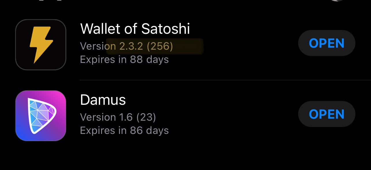
🚨 Announcement time! 🚨

We're proud to unveil our refreshed Wallet of Satoshi logo! ⚡

Staying true to being 'The World's Simplest Bitcoin Lightning Wallet,' we transition from our classic design to a simpler, friendlier and more modern aesthetic.

https://void.cat/d/TsFTEiBtvNyY89AhhDCde2.webp

We hope it grows on you as it has us, becoming the first sight for the next billion Lightning users exploring #Bitcoin!

Watch out as the new look gradually rolls out!

You might spot it in a double stacked format too.

We want to hear - what are your thoughts on our new look?🤔

https://void.cat/d/GA9xNygqwrgjiAJ4LtqbCZ.webp

Reply to this note

Please Login to reply.

Discussion

Wos mate wos

Agree 👍

Cool

Yes it's cool

The first is beautiful 💜🎩⚡🧡

Very nice refresh.

Now it looks like it's 2023, while keeping the same vibe. 😄

Nice

LGTM

Elegant simple ⚡️WOS

Overall I like it! But something about the placement of that lightning seems a bit off.

good⚡️👍

Yeah, good and simple!

very nice

Yes nice!

いいと思う⚡

Nice! Shouldn’t the logo in the stacked format be around the same height as the fonts instead? 😀

Now please hire UX researcher. 😉

What’s wrong with their UX?

Many small things. I see it every time I onboard some non-IT people.

I especially like the updated shape/proportions of the lightning bolt icon 💜

It's looking way better than before. Well done!

💪🧡⚡️

I always opt for giving honest feedback when requested.

So, you asked.

I really like your old logo.

Meaning i don't think this is an improvement.

Fortunately people are not choosing your wallet cause of its logo.

Looks good. I think the stacked version might need some proportion tweaks. You guys should also buy the domain name wos.app so we don’t have to type in the whole thing manually to enter a user address.

Looka nice, but wos its not foss 🐸

Nice to see a logo refresh that, for a change, doesn't suck. 👍

Just curious: how are you able to circumvent Australian anti money laundering laws? Or how do you plan to deal with new upcoming changes in 2023?

https://www.landers.com.au/legal-insights-news/whats-next-for-cryptocurrency-regulation-in-australia-2023

Would it not be a good idea to start looking at other jurisdictions?

Felicitaciones

Looks great!

cool!

I honestly prefer the previous. Now it blends in with all the other brand logos using the exact same design language.

Squircle logo + boring text.

Love it! Keep it up 💨

sexy

Old logo was great do. Anyways congrats! every step forward is a reason for celebration.

WoS is aWOSome! ⚡️🧡

Dope!

Lightening bolt is looking fat.

Thank you, just keep the nodes alive!

一直在使用,很欢这款钱包!

I liked the “DIY” spirit of the old one, but this is clean and neat.

Congratulations 🥳

One potential bug to report: I’m running iOS 17.1 (dev beta) and the Test Flight version of WoS, when attempting to add an amount and/or note to a lightning invoice, after tapping the icon to change from “sats” to “$”, I get a “Copied Lightning Invoice to clipboard” message and no format change nor the ability to enter an amount or a note

Again, just reporting even though running the iOS 17.1 beta. The issue above does not occur with the App Store version and the iOS 17.1 beta

Thanks heaps for reporting. We’ll check it out.

Could you please try this again with latest TestFlight v257 when you get a chance :)

Hmmmm…I only see v256 in TestFlight (even after refreshing the app). I’ll check later to see if it has been pushed to me

I just got WoS v257 in TestFlight and the aforementioned problems have been resolved. Thank you 😊

Awesome! Thanks again

Can you share the Test flight link with me? I just got bumped off and can't find it.

Nice!!

Looks clean. I like it 😎 🤙